
Caroline Culp
In 1767, the Boston-born portraitist John Singleton Copley debuted Young Lady with a Bird and a Dog in London at the Society of Artists of Great Britain annual exhibition (Fig. 1).[1] As a self-taught artist working in New England, Copley (1738–1815) was eager for feedback from the distant metropole. Joshua Reynolds, the then authority on the genre of portraiture, saw Copley’s painting on display and noted that it lacked finesse in its “Colouring.”[2] He said, for example, that the palette was “very Briliant” (by which he meant something like “brightly colorful”). But he said that this brilliancy was “Somewhat missapplyed, as for instance, the Gown too bright for the flesh, which over Came it in Brilency.”[3]
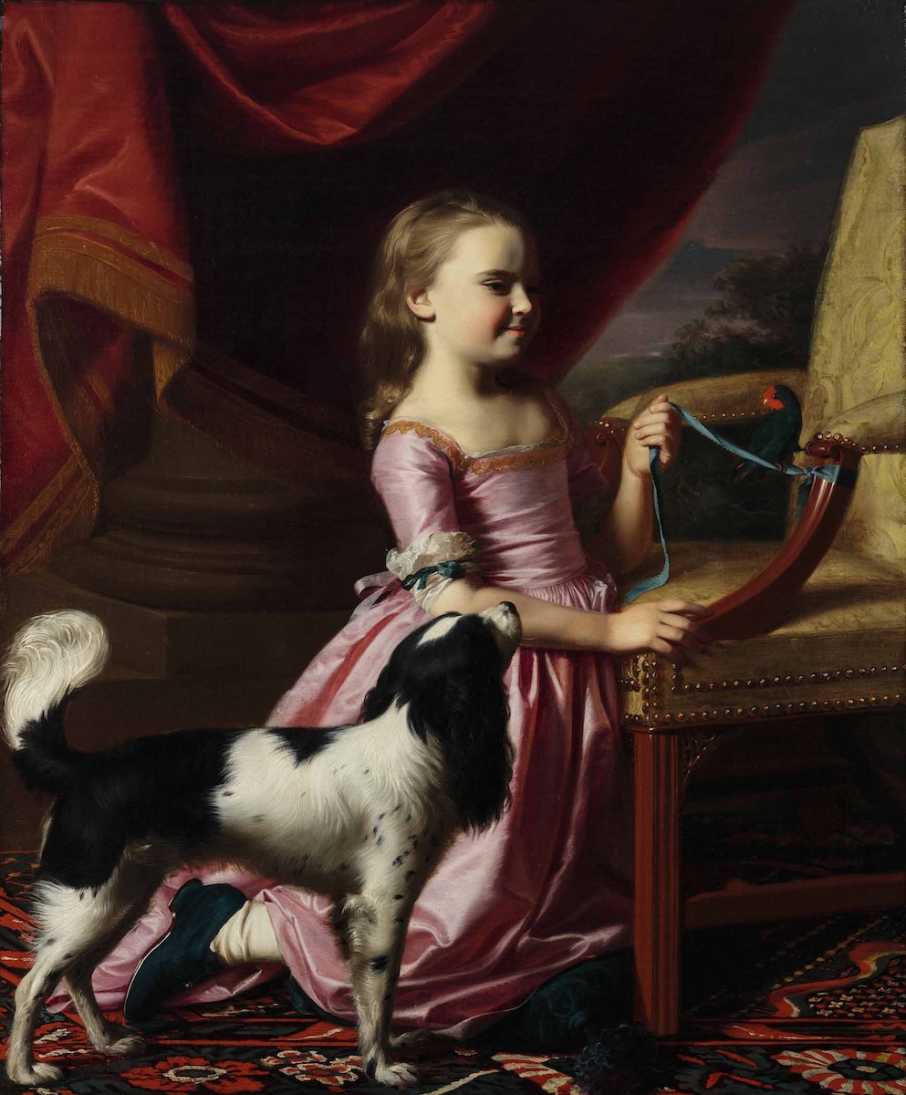
Copley’s overwrought palette reflected his limited access to European models. Though the artist wanted to imitate contemporary painting styles popularized by figures like Reynolds, he could only study such works as monochromatic reproductive prints or learn about them through written correspondence and published painting manuals—all printed materials imported from Europe. Unfortunately, as both Copley and Reynolds found, color’s inherently visual nature made it verbally indescribable. While Reynolds criticized Copley’s coloring in Young Lady with a Bird and a Dog, he could not articulate with precision the flaws in the younger artist’s palette. It was, he said, “impossible to convey” exactly what he meant “by Words.” But, Reynolds promised, if Copley could see the examples he had in London, he “could make you instantly feel it by Example, if you was here.”[4] Such physical effects of the painted palette—the psychosomatic feeling of color—evaded the vocabularies and the reproductive technologies available to eighteenth-century painters. This essay examines the ways in which Copley’s limited access to academic training and painterly models profoundly affected his use of color and ultimately determined the aesthetic qualities of his portraits.
Copley’s Color, Contextualized
From across the Atlantic, Copley strained to model painting styles popular in Europe by turning to the prints he could see, and to the training manuals and theoretical treatises he could read.[5] These seemingly informative guidebooks narrativized visual practices and chronicled painting techniques. Perhaps Roger de Piles’s popular manual Principles of Painting (1708), which Copley referenced, convinced the artist that he could learn the essential principles of “design” and “coloring” from a distance.[6] But these textual resources, dependent as they necessarily were on linguistic descriptions of imagistic effects, had limited functionality in the colonies. Even de Piles admitted that, in painting, “colouring has not any rules that are yet well known; and the experiments that are made…have not been able to give any fixed rules on this head.”[7] Thus at the same time that the relative merits of color versus drawing were at the center of artistic debates in Europe, Copley was struggling to imitate the subtle chromatic effects of works he could not access in colonial Boston. Working without guidance or “fixed rules,” the artist adopted his own idiosyncratic techniques for mixing, applying, and working color—all of them in service to his primary aim of conveying a sense of lifelike vitality in his inanimate portraits.
Indeed, the apotheosis of artistic accomplishment in the British-American colonies was to produce a “speaking” or even a “living” picture.[8] In 1771, the artist Matthew Pratt said of Copley’s Margaret Kemble Gage that it “will be flesh and Blood these 200 years to come,” and “every Part and line in it is Beautifull,” so much so that Copley must get his “Ideas from Heaven.” More than two decades later, in 1794, a patron mourning his wife’s death took comfort in Copley’s portrait of her, describing the image’s viability as an “endeavour to embalm the Memory” of the woman herself.[9] And, following Copley’s death in 1815, John Adams claimed the artist’s portraits felt so vital and real that “you can scarcely help discoursing with them, asking them questions and receiving answers.”[10] Despite the frequent occurrence of comments such as these, seldom have scholars taken Copley’s drive to paint uncannily naturalistic portraits seriously, much less considered the ways his use of ground pigments allowed him to do so.
In the now vast archive of writings about Copley’s portraits, only rarely have scholars commented on the strange animacyof his portraits and attempted to explain this uncanny naturalism with reference to archival evidence. Margaretta Lovell, while focusing on Copley’s portraits as dictations of family lineage and vehicles for identity construction, briefly mentions the perceived magic of portraiture in early America. “The first job of the portrait was to depict a unique, almost magical likeness, bringing the sitter into the presence of the viewer,” she states, while asserting that it was Copley’s particular “magical capacity to create illusion” that distinguished him as the colonies’ preeminent portraitist.[11] But these provocative statements are presented as sporadic and incomplete synopses, first and last thoughts on the issue. David Bjelajac’s publications recovering Copley’s parallels with local investments in alchemy, magic, and Freemasonry have moved these discussions forward by bringing the artist back into contact with such period belief systems.[12] These rich historical discussions encourage further examination and application to a wider variety of the artist’s works.
More recently, and related to the present discussion of color, Nika Elder has recontextualized Copley’s depiction of skin color and tone to understand his relationship with the institution of slavery and the ways his pictures visualized a family’s “racial inheritance.”[13] By asking new questions about Copley’s use and philosophy of artistic pigments, this essay extends Jennifer Roberts’s reframing of Copley as a theoretically driven artist whose sincere and direct style was based not in primitive, “unspoiled vision,” but rather in the period’s transnational desire for “connection over distance” that “animated both empire and empiricism.” Roberts interprets Copley’s portraits as “active delegates” connecting the geographically distant spaces of the British empire.[14] Similarly, this essay investigates the transatlantic contours of color in the eighteenth century and the languages used to measure and communicate it in order to understand how Copley’s distance from London did not dilute the vitality of his portraits but instead enhanced it.
The following text thus centers Copley’s deployment of color, analyzing its linguistic, philosophical, and empirical permutations to argue that the artist’s use of chroma was designed to allow his works to exceed the natural boundaries of portraiture. Lustrous and saturated, color is the central vehicle through which human presence is conveyed and preserved in the artist’s works. It was Copley’s position as a self-taught artist on the fringes of the British empire that resulted in his developing unique techniques of color matching, intense saturation, hard outlines, and color tensions—aesthetic effects that heightened the lifelikeness and immediacy of his sitters. This peripheral position—which Copley vehemently resented and worked hard to overcome—ironically enhanced his ability to capture his sitters in vivid color and so “embalm” their memory.
Translating Color
As the exchange between Copley and Reynolds that opened this essay suggests, color was considered one of the most important elements of painting by eighteenth-century artists, but it was impossible to learn the specifics of its mixing, application, and composition at a distance. Without hands-on instruction or accurate color reproductions, in Boston Copley turned to black-and-white prints and text-based descriptions of color as primary training tools—methods with limited accuracy. Even today contemporary studies confirm that precise and consistent description of color in the visual arts is a field nearly beyond language. As Stella Paul has noted, “Color nomenclature in all languages is notoriously confusing and never universally agreed,” because “Language both reflects and limits conceptualization.”[15]
Beginning in 1766, correspondence with Benjamin West had Copley disparaging his home as an artistic backwater—“so remote a corner of the Globe as New England.”[16] Lamenting the shortage of high-quality paintings upon which he could model his own, he complained:
I think myself peculiarly unlucky in Liveing in a place into which there has not been one portrait brought that is worthy to be call’d a Picture within my memory, which leaves me at a great loss to gess the stile that You, Mr. Renolds, and the other Artists pracktice.[17]
Weary of looking at the small-scale, black-and-white engraved copies and only guessing at “the stile” articulated by the most prominent artists of the day, Copley felt sure that seeing and studying the brilliantly colorful paintings of Europe would “annimate my pencil, and inable me to acquire that bold free and gracefull stile of Painting.”[18] Absent other instruction, the stylistic variances in Copley’s colonial practice thus stemmed from the scholastic models available to him: prints, painting manuals, and a few painted copies of Renaissance-era pictures.
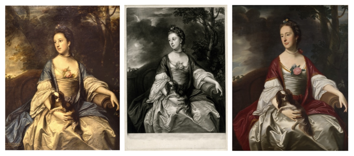
MIDDLE: Fig. 3. James McArdell after Joshua Reynolds, Lady Caroline Russell, c. 1759-1760. Mezzotint, 36 x 24.8 cm. The British Museum, 1868,0822.2126. Image courtesy of the British Museum.
RIGHT: Fig. 4. John Singleton Copley, Mrs. Jerathmael Bowers (Mary Sherburne), c. 1763. Oil on canvas, 126.7 x 101 cm. The Metropolitan Museum of Art, 15.128. Image courtesy of the Metropolitan Museum of Art.
Hundreds of black-and-white prints—most of them European old master paintings rendered at reduced scale—thus became foundational training tools for the young artist.[19] Joshua Reynolds’s circa 1759 portrait of Lady Caroline Russell offers an early example of the artist’s importation of British compositions via black-and-white prints (Fig. 2). Copley remade Reynolds’s portrait by looking at James McArdell’s mezzotint reproduction of it, which was available to him in Boston (Fig. 3). This process of duplication starkly impacted Copley’s application of color, as evidenced by his circa 1763 Mrs. Jerathmael Bowers (Mary Sherburne) (Fig. 4). Working from the grayscale of the mezzotint to render a colonial subject in the guise of Reynolds’s English Lady, Copley substituted Mary Sherburne Bowers’s face directly into Caroline Russell’s original portrait. He copied, with relative accuracy, Russell’s bench, her Blenheim spaniel, breezy park setting, elegant pose, and averted gaze. But with only the print for reference, Copley was likely unaware of the fact that Lady Caroline Russell’s dress was blue in the original painting. His reproduction instead features an uncorseted caftan dress in deep ruby.
The color of the gown is not the only change, however. Reynolds’s contours are soft, with gradual transitions and delicate modeling. The composition is articulated in gentle mid-tones, with linens and distant sky hazed a golden cream. These aspects of Reynolds’s painting are continued in the tonalities of the monochromatic mezzotint. In contrast, Copley’s rendition is less painterly and more slick. The blocky planes of Bowers’s gown feel almost viscous, with contours both syrupy and artificial. The gown’s over-brightness—a piercing eggshell white profiled directly against the dark ruby caftan—and its abrupt modeling lends the fabric an almost synthetic feel. The most realistically rendered part of the picture is the one element that Copley copied from life: his sitter’s face. Copley’s novel tonal combinations led him to luscious and lurid color patterns such as those found in Bowers. With each block of hue intense and separate from its neighbor, color and modeling in Bowers is more like the bright patchwork of many medieval paintings than the brushy nobility conveyed by the Grand Manner portraits of London’s elite.
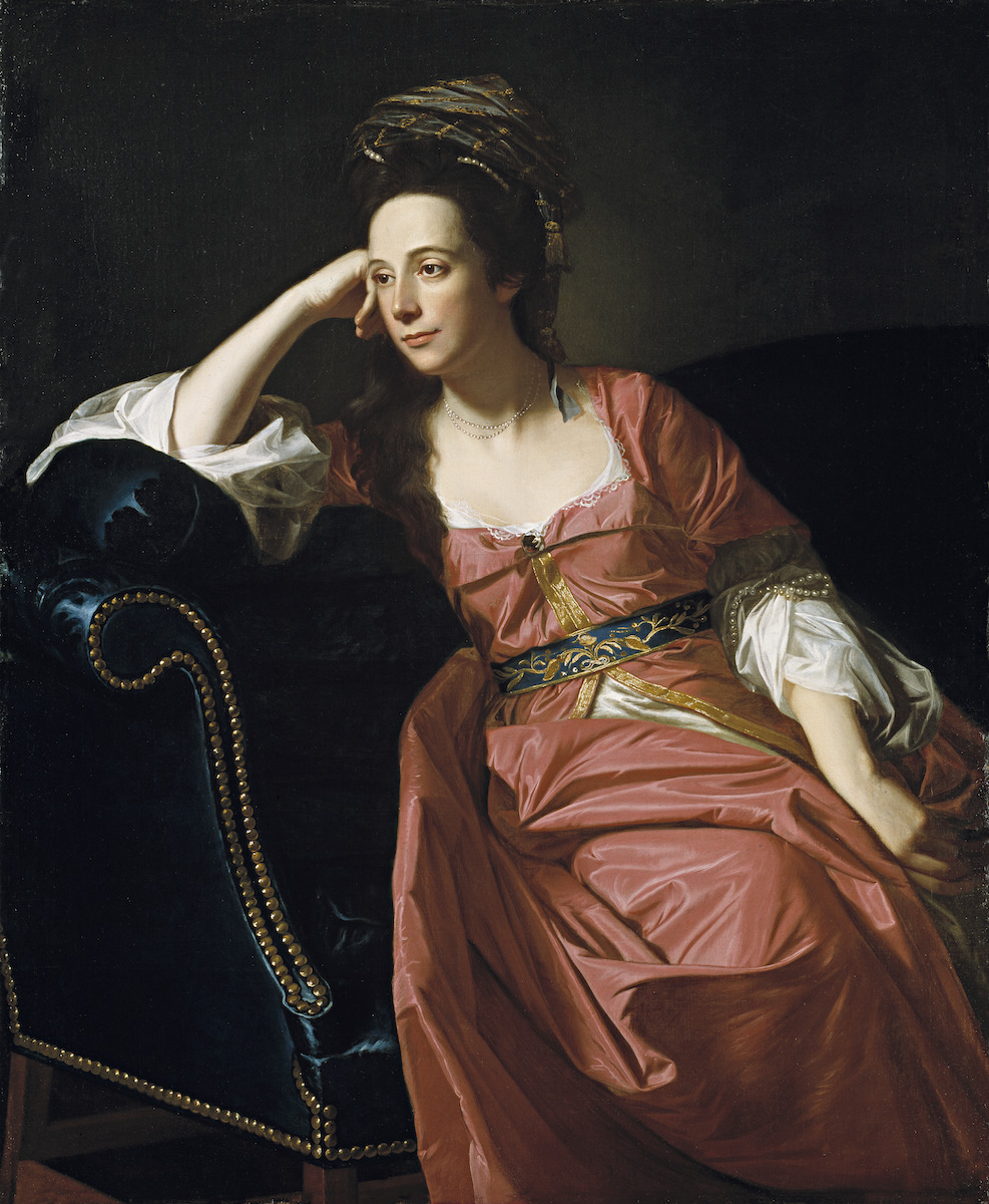
The lasting influence of the print medium on Copley’s colonial production can be found in the formal qualities of his later American portraits as well, in their penchant for dramatic shifts between light and dark and tendency toward spatial flatness. Margaret Kemble Gage (1771) is just one of many portraits exhibiting these qualities (Fig. 5). The hard lines of Copley’s darkened interior space are austere, ruled by chiaroscuro’s dramatic force. This high-contrast configuration focuses attention on the subject’s face, which is further emphasized by the right triangle of negative space below the span of her gleaming forearm. Her head is suspended—with virtually no transition—between severely highlighted zones and areas of impenetrable darkness. Such a pictorial equation hinges on the strategic deployment of lightness, darkness, and flatness to exploit the possibilities of a starkly graphic composition. Together these qualities effectively draw attention to the lamb’s-ear softness of Margaret’s skin and the immaculately described objects that surround and adorn her body. In the directness and simplicity of the composition, in its shallow spatial field and the severely abrupt shifts in hue and light, and in the artist’s sharply contoured forms lacking the minutia of fine modeling, Copley betrays his adherence to the semiotics of print. The graphic quality of flatness and chiaroscuro derived from prints intensify the immediacy of Copley’s sitter.
Adding to these chromatic effects, in this portrait as in others by the artist, the smallest filaments of white lead paint, threaded at the bottom of her left eye and glossed at the tip of her nose, flash the sitter’s face to life. The picture captures the compelling presence of Margaret Gage and the essential spark of her surroundings to a degree that is affecting and uncanny. Fellow portraitist Gilbert Stuart intuited Copley’s impressive skill when he effused of a similar Copley portrait, “Prick that hand and blood will spirt out.”[20] Such compliments reflect firmly established ideals of naturalism for the art of the period, standards pursued by most professional painters across the British-American colonies at the time. However, no other painters achieved the same degree of success as Copley, whose unique use of pigments was arguably the direct result of his lack of formal training in oil-based colorants.
Idiosyncratic Applications
Most likely guided by trial-and-error methods and textual manuals, Copley had to advance his own sense for color’s application, layering, and mixing—complex processes not easily translated into words.[21] In these experiments he did have regular access to basic ground pigments imported from London and other European centers by Boston’s colormen. By 1771, for example, John Gore of Boston listed 44 artist pigments sold at his shop at the Sign of the Painters Arms in Queen-Street.[22] Copley’s understanding of how to mix and apply the eight different kinds of ground yellow pigment advertised by Gore would have been developed without much outside instruction.
As an autodidact, Copley created works that were removed from the standard dictates of period art schools such as London’s Royal Academy. Founded in 1768 and adopting the systematic training structure in which aspiring artists copied Renaissance masterworks from life, the institution and its history take part in the period impulse for intellectualization and professionalization and against the perceived amateurism of craft. In an eighteenth-century arts culture dominated by the value systems of Europe, education became the standard against which creative value was measured. In contrast, because of his lack of formal training, Copley fixated on color, its expressive potential in his portrait practice, and the live model. After he had fled Boston for Europe in 1774, British painters in Italy remarked on his maniacal perfectionism in painting from life. By virtue of its strangeness, his peers noted the artist’s methodical manner of “tint matching”—a process for mixing colors on the palette before applying them to canvas. As a later biographer recalled, “Mr West told me he [Copley] was the most tedious of all painters. When painting a portrait, he used to match with his palette-knife a tint for every part of the face, whether in light, shadow, or reflection. This occupied himself and his sitter a long time before he touched the canvas.”[23]
Modern technical studies corroborate this anecdotal account of Copley’s tint matching, as X-radiography of his canvases show dense modeling in the faces and more measured pigment application in shadows, backgrounds, and fabrics.[24] Conservator Marjorie Shelley notes the artist’s precisionist working methods in pastel, where, especially in the faces, “complexions are produced with a range of pinks, carmines, and whites arranged and smoothed to make the stroke of the crayon invisible,” and tonal progressions move “from the pale tints beneath the eye through the ecrus, pinks, greens, and gray of the five-o’clock shadow at the sitter’s jawbone.”[25] Even Catherine Hill Henshaw’s lips required six or seven distinct red and brown pigments.[26] Copley undertook much the same process when painting fabrics and furniture. Working from a layman figure—a human form carved from wood with hinged, arrangeable limbs—Copley prioritized direct observation when painting clothing, which he borrowed from his sitters and positioned on his layman in his studio to paint from life.[27] He was even known to use a compass to measure precisely his sitter’s head, face, arms, and legs before beginning work on a portrait.[28]
Copley’s technique for applying color was disregarded by professionally trained artists as “tedious,” provincial, and prohibitively time consuming.[29] But it was his deployment of color that gives his works such a startling impression of lively presence. Because he could not see or study the techniques of chromatic variation he so wanted to emulate, because he could only read about them, Copley’s obsessive color matching hoped to overcome the distances he faced—the distance between Boston and London. It was this distance which made capturing color in precise facsimile even more important for Copley. Not having access to many examples of color in painting led him to equate color with precise proximity to the original. Further still, it was in spending such enormous amounts of time communicating the faces of his sitters onto canvas—of holding up each shade to the face, of finishing every hair, and fingernail, and blue stubble of beard—that Copley created images which attempted to transfer reality into an object. Taking Copley’s habit of tint matching seriously allows us to better understand the ideologies that lie beneath his techniques, and thus his intentions, motivations, and aspirations for his portraits. Driven by a wish to preserve the human body as a relic within the canvas, to “embalm the Memory” of his sitters, Copley’s hyper-real portraits preserved sitters’ faces and hands, mummy-like, through the vehicle of color. Copley’s peripheral position within the British Empire thus enhanced his artistic practice in striking ways.
Copley would not have welcomed this reading. Saturating his correspondence during the period leading up to his departure from Boston in 1774 are incessant references to “the works of the great Masters,” and “those Renowned Masters,” and “the Works of the first Masters.”[30] He was a man obsessed; consumed with a preoccupation for that which he could not see. Copley thus turned to the few painted copies of Renaissance paintings he could access in colonial Boston—copies by John Smibert, who had painted portraits in London and Edinburgh and traveled in Italy before arriving in Boston in 1728. In addition to importing and selling artists’ materials in his studio, Smibert also displayed a small collection of plaster casts of classical sculptures and his own painted copies after Raphael, Titian, Anthony van Dyck, Tintoretto, and Nicolas Poussin. Copley’s palette was modeled on these copies, which had been completed in Florence and brought to Boston as instruction tools for Smibert’s art school that was never established.
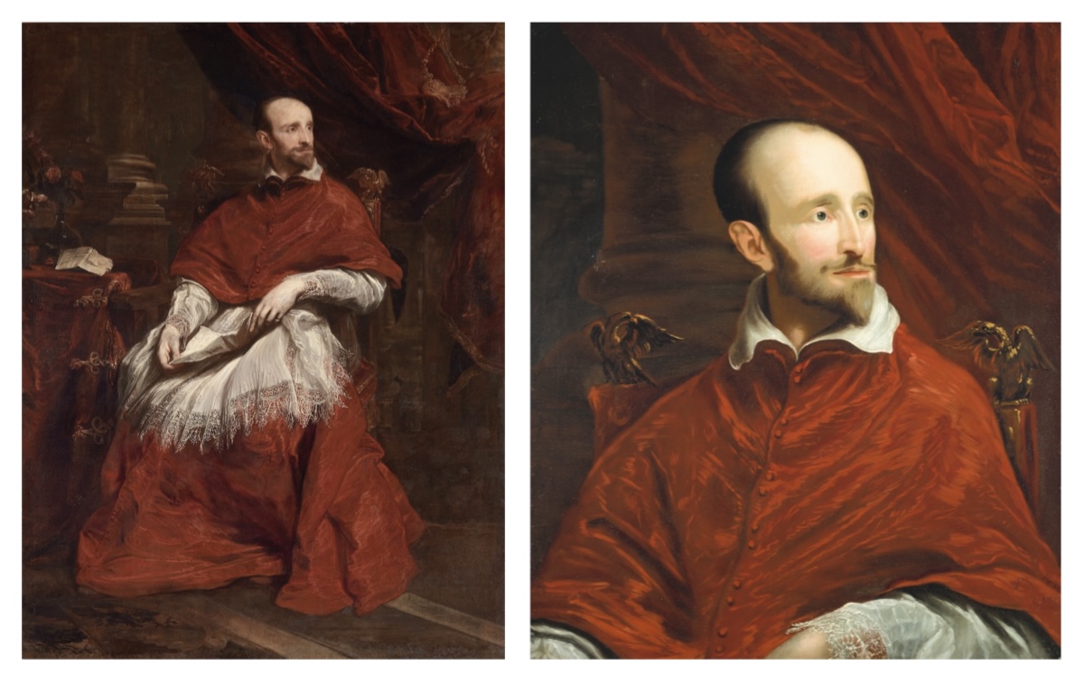
RIGHT: Fig. 7. Attributed to John Smibert, after Anthony van Dyck, Cardinal Guido Bentivoglio, c. 1719-1720. Oil on canvas, 75.8 x 63.4 cm. Harvard Art Museums/Fogg Museum, Transfer from Harvard University Portrait Collection, Gift of John Trumbull to Harvard College, 1791, 1969.50. Photograph © President and Fellows of Harvard College.
One of these copies was of van Dyck’s Cardinal Guido Bentivoglio, which reproduces the full-length original into a bust-length copy (Figs. 6 and 7). Copley certainly studied Smibert’s copy in the elder artist’s studio, which was maintained as a gallery and supply store by Smibert’s nephew following the painter’s death in 1751. Smibert’s reproduction after van Dyck provides an essential clue into Copley’s development as a colorist. In his replica, Smibert amplified the vibrancy of van Dyck’s red robe by lightening its tone or value. What van Dyck had painted in ruddy garnet tinged with earthy muted browns became, in the copy, a portrait dominated by cherry red shot through with scintillating honey gold highlights. The flattened, simplified patterns of Smibert’s copy, from the drapery to the shadows, echo the overall effect of a reproduction that is brighter, warmer, and less soft than its gentle cool-toned original. Copley’s use of color, with its origins in Smibert’s misguided copy, became bold and effusive, quite the opposite of the sobriety and control exhibited by van Dyck’s earth tones of the previous century.
Van Dyck’s Bentivoglio was not the only instance of Smibert’s chromatic alterations. Writing from Italy in March of 1775, his first full year away from the colonies, Copley recalled:
the Coppy at Smibert’s of the Holy Family, which although a Coppy from Raphael, is notwithstanding very diferent from his Painting….the Original, which is at Florance, I have seen, and find it has nothing of the olive tint you see in the Copy, the read not so bricky in the faces, the whole Picture finished in a more rich and correct manner…the whole Picture has the Softness and general hew of Crayons, with a Perlly tint throughout.[31]
As Smibert’s copies became standard training tools for early American artists, these seemingly innocuous changes had a profound impact on the direction of early American painting.[32]
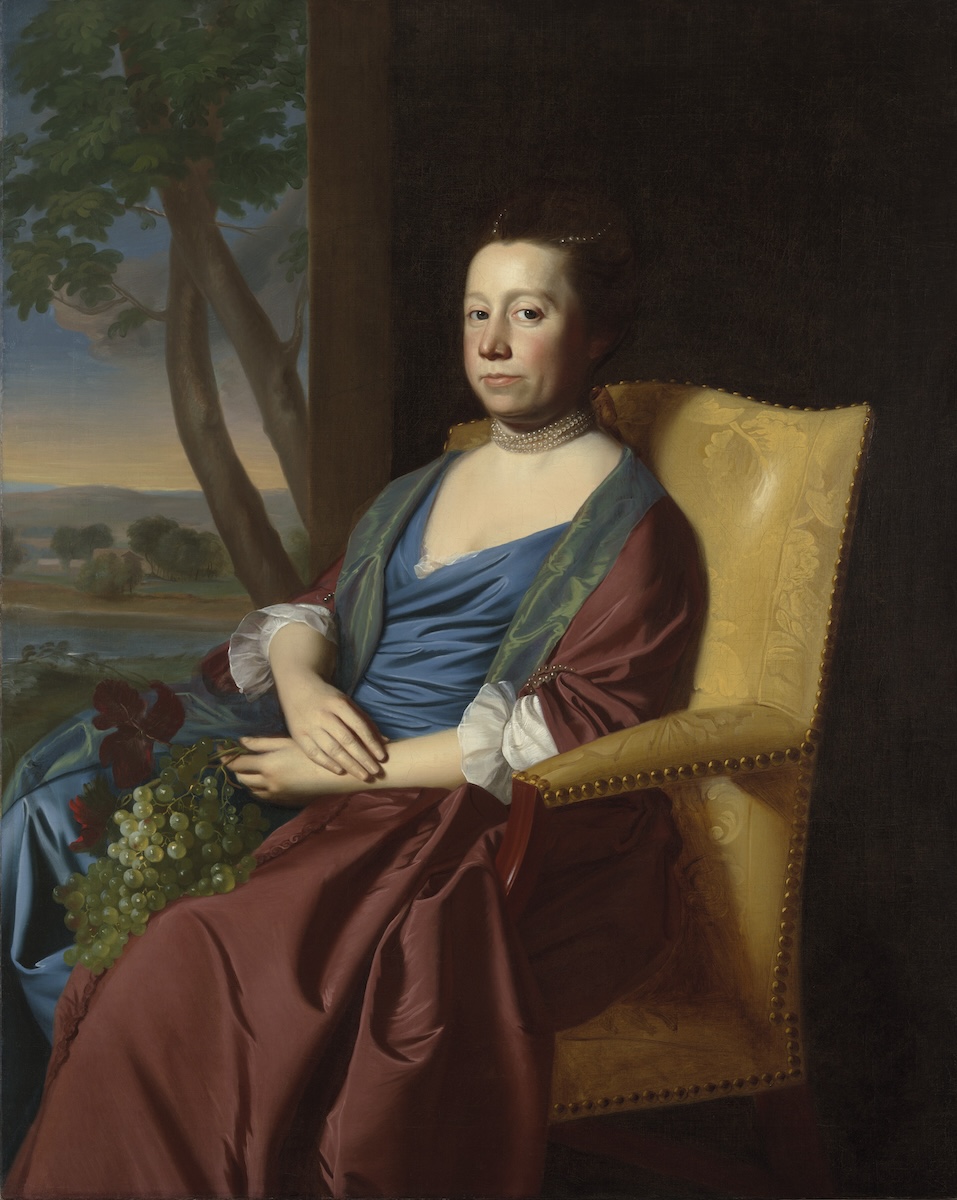
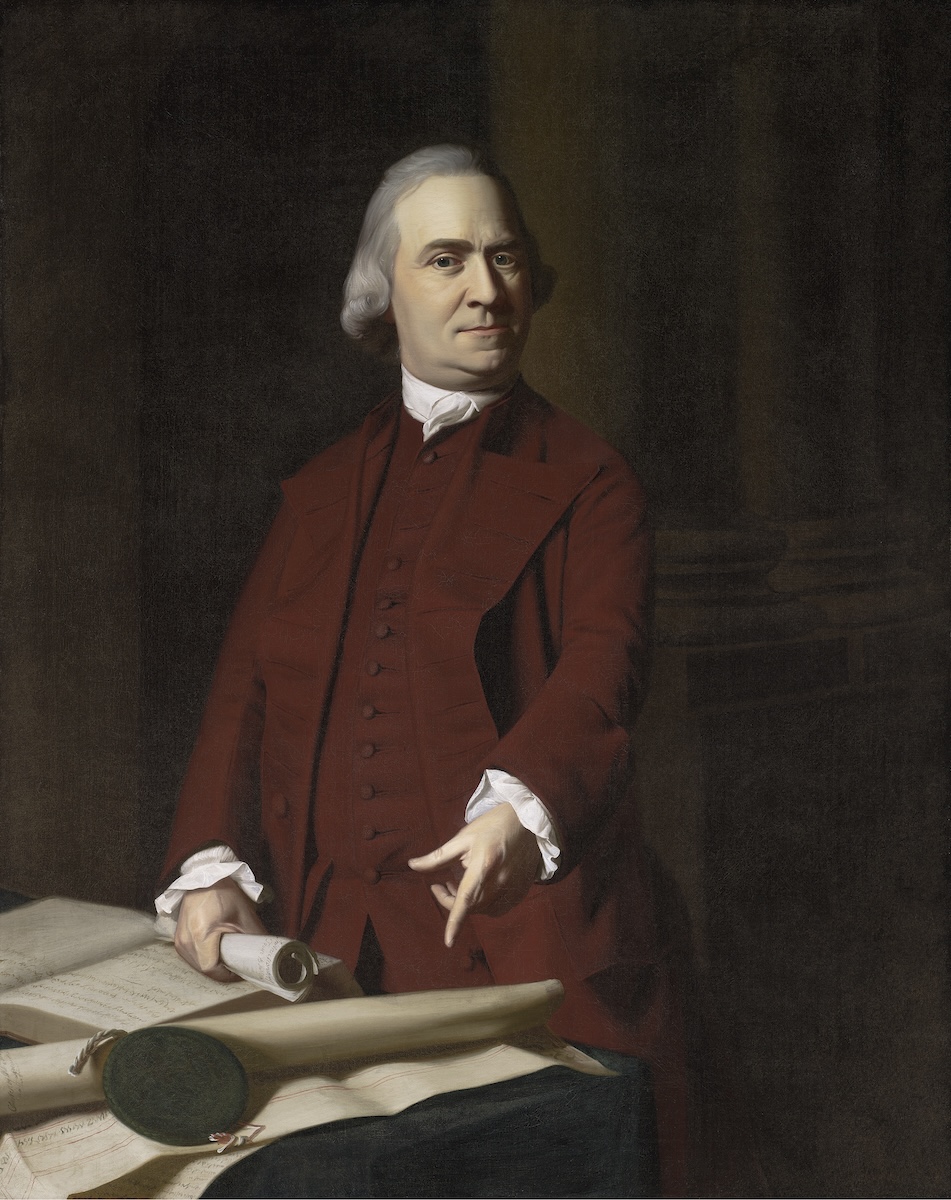
In Copley’s American works, broad planes of “saturated” hues—colors marked by high amounts of pure, undiluted color—abut one another, exciting the senses and amplifying the perceived impression of vitality.[33] In Elizabeth Storer Smith (1769), for example, an electric blue wrapping gown seems to visually vibrate because of its proximity to the pollen yellow of her chair’s botanical damask upholstery (Fig. 8). An especially sharp profile is formed where the golden fabric borders the burnt sienna pools of the woman’s silk robe. As with many of Copley’s American pictures, the dominant colors of the picture are brilliant and contrasted, with the figure’s crisp contours set off against a juxtaposing background. Even in Copley’s compositions dominated by the gravity of muted earth tones like Samuel Adams (c. 1772), there is a single-minded pursuit of saturated planes of color containing only one color (Fig. 9). The boldness and contrast of these unmixed planes of pigment effectively enhance the overall directness and force of his portraits as contrasting colors jut up against one another.
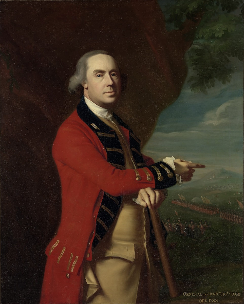
Even when painting the variant topography and intricate folds of a dress or suit, Copley did not mix his hues. As Jules Prown observed, the painter “controlled the play of shadow and highlights by using light and dark variants of the same color,” as opposed to his one-time rival, the Europe-trained drapery painter Joseph Blackburn, who incorporated new colors into the shadows and highlights of arranged fabrics.[34] This is especially true of General Thomas Gage (c. 1768, Fig. 10). Gage’s coat is one column of pure scarlet with no modulation, save a few brief ripples of darkened shadow for modeling. This passage of flat, pure color is a signature of Copley’s colonial works: blocks of unmodulated color together create a bright patchwork of organized rhythms. Each color is distinctly intense and separate from its neighbor, as General Gage’s red coat is squeezed between a backdrop of brown earth and the wide black ribbon of his collar. The overall effect of these high contrasts and sharp transitions is to make the colors more radiant, leaving the sitters feeling more intensely present and alive—a mosaic of unblended forms.
In Margaret Kemble Gage, the interplay of colors enhances the picture’s impression of human presence (Fig. 5). Setting off the composition’s bright central figure is the midnight blue of a camelback sofa. The shadowed hollows that bracket her silk-adorned body are made of wedges of paint so dark they appear as voids. The dramatically abrupt hue shifts between her lit body and these voids are transition-less zones where red and blue, warm and cool colors abut. The resulting color tension actively heightens the sitter’s vibrancy.
Copley nearly always deployed coloristic tensions such as these in his portraits. The artist’s formula would combine within one composition the heavy qualities of earth tones like brown or maroon with the “sweetness” and “airy” lightness of what were then called “aereal” colors—white, fine yellow, blue, green.[35] One of Copley’s favorite combinations was brown and blue, which created a play between warm foreground colors and a cool background, or vice versa, heightening the visual impression of opposing forces visually balanced within the picture. This opposition could also be accomplished within a pair of portraits—like Thadeus and Eunice Dennie Burr, or Elizabeth and Ebenezer Storer II—by having the pendant reverse its partner’s sequence of warm and cool colors. In pendant portraits, the assignment of warm color and cool color was not dictated by the gender of the sitter. Instead, Copley sought out unresolvable color tensions, lending his portraits balance and the impression of internal energy.
Situated in this context, designating Copley a self-taught artist demonstrates how idiosyncratic approaches to learning could result in the creation of more dynamic and complex portraiture. In the case of Copley, this idiosyncrasy bears fruit as a certain hypersensitivity to the human subject. Copley’s use of intense saturation, hard outlines, and color tensions was markedly different from the styles expected in established academies of Europe. By investigating the transatlantic contours of color in the British Empire and the languages used to measure and communicate it, we can better understand how Copley’s self-taught methods for color mixing and application attempted to overcome the distances he faced—the distance between Boston and London—by rendering his sitters as vividly present as possible. Although the artist was insecure about his own amateur status and lack of formal education in colorants, his technique of tint matching and corresponding deployment of color gives his works a startling impression of lively presence. If we identify the virtues of Copley’s nonacademic American practice, we enhance our awareness of the at-times confining proscriptions of structured educational systems. Knowing that one of the most important and influential eighteenth-century painters in the history of American art was not the product of an elite school of art destabilizes normative categories for artistry. It is no exaggeration to claim that Copley’s peripheral position within the British empire ironically enhanced his artistic practice, which aimed to “embalm the Memory” of his Bostonian patrons by endowing the inert material of oil-based pigments with the uncanny impression of animate presence.
Caroline Culp is the Warren Family Assistant Curator at the American Folk Art Museum in New York City (position begins fall 2024)
[1]Young Lady with a Bird and a Dog was first exhibited in 1767 under the heading “Mr. William Copeley, Boston, New England.” See Jules David Prown, John Singleton Copley, vol. 2 (Cambridge, MA: Harvard University Press, 1966), 387.
[2] “Captain Bruce to Copley, June 11, 1767.” In John Singleton Copley, Letters & Papers of John Singleton Copley and Henry Pelham, 1739-1776 (hereafter Copley Pelham Letters) (Boston: Massachusetts Historical Society, 1914), 52.
[3] “Benjamin West to Copley, June 20th, 1767.” Copley Pelham Letters, 56. In his Discourses, Joshua Reynolds makes brief reference to “brilliancy” in coloration when discussing the use of color by Venetian artists: “Their colouring is not only too brilliant, but, I will venture to say, too harmonious, to produce that solidity, steadiness, and simplicity of effect, which heroic subjects require, and which simple or grave colours only can give to a work.” See “Discourse IV: Delivered to the Students of the Royal Academy, on the Distribution of the Prizes, December 10, 1771,” printed in Sir Joshua Reynolds’ Discourses: Edited, with an Introduction, by Helen Zimmern (London: Walter Scott, 1887), 49.
[4] “Captain Bruce to Copley June 20, 1767.” Copley Pelham Letters, 56. Later, after leaving the British colonies, Copley would write something similar in a letter to Henry Pelham as he attempted to describe the impact of color in Italian painting: “But I know not what to refer you to by which you will form to yourself the Idea I wish to convey to you.” Copley Pelham Letters, 250-51.
[5] From existing correspondence, we know the artist used several painting manuals to supplement his self-directed education. These texts include Count Francesco Algarotti’s An Essay On Painting (1762), Charles du Fresnoy’s De Arte Graphica (1668), Roger de Piles’s The Principles of Painting (1708), Horace Walpole’s Anecdotes of Paining in England (1765), Daniel Webb’s An Inquiry into the Beauties of Painting (1760), and George Turnbull’s A Treatise on Ancient Painting (1740).
[6] Copley owned a copy of The Principles of Painting by de Piles; see Copley Pelham Letters, 170. Copley likely learned from this source and trusted its authority, which was the most important and influential collection of recipes on French painting techniques in the early eighteenth century.
[7] Roger de Piles, The Principles of Painting […] (London: printed for J. Osborn, at the Golden Ball, in Pater-Noster Row, 1743), 207.
[8] The term “speaking picture” is used by Charles Willson Peale in an 1818 letter to Thomas Jefferson: “with the expedetion [sic] of my pencil I shall, I hope, make a speaking picture.” See “Charles Willson Peale to Thomas Jefferson, January 15, 1818,” Founders Online, National Archives. A reference to “living pictures” can be found in “Abigail Smith Adams to John Quincy Adams, December 14, 1817,” Founders Online, National Archives.
[9] “Daniel Denison Rogers to Abigail Adams, June 2, 1794,” Founders Online, National Archives. Rogers gifted Adams “a likeness of my Angel-Wife,” noting in full: “The Endeavour to embalm the Memory of a Woman of so many amiable, estimable Virtues, and pleasant agreeable Qualities in the Minds of her friends, as well as in my own; will, I hope, be delightfull to me thro’ Life.”
[10] “John Adams to Benjamin Waterhouse, February 17, 1817,” Founders Online, National Archives.
[11] Margaretta M. Lovell, Art in a Season of Revolution: Painters, Artisans, and Patrons in Early America (Philadelphia, PA: University of Pennsylvania Press, 2005), 46, 138, 25.
[12] David Bjelajac, “Freemasonry’s ‘Living Stones’ and the Boston Portraiture of John Singleton Copley,” in Freemasonry and the Visual Arts from the Eighteenth Century Forward, ed. Reva Wolf and Alisa Luxenberg (New York: Bloomsbury Visual Arts, 2019), 95-118; and Bjelajac, “Mercurial Pigments and the Alchemy of John Singleton Copley’s Watson and the Shark,” in Analyzing Art and Aesthetics, vol. 9, Artefacts Series, ed. Anne Collins Goodyear and Margaret A. Weitekamp (Washington, DC: Smithsonian Institution Scholarly Press, 2013), 144-66.
[13] Nika Elder, “In the Flesh: John Singleton Copley’s Royall Portraits and Whiteness,” Art History 44, no. 5 (2021), 970.
[14] Jennifer L. Roberts, Transporting Visions: The Movement of Images in Early America (Berkeley, CA: University of California Press, 2014),34-5, 3. Roberts critiques James Flexner’s 1948 celebration of what he romantically deemed Copley’s “unspoiled vision.”
[15] Stella Paul, Chromaphilia: The Story of Color in Art (London; New York, NY: Phaidon Press, 2017), 8.
[16] “Copley to Jean-Étienne Liotard, September 30, 1762.” Copley Pelham Letters, 26.
[17] “Copley to Benjamin West, November 12, 1766.” Copley Pelham Letters, 51-52. Later in the same letter, he would inquire “weither any prints after Corregios or Titianos are to be purchased.”
[18] He continues, “that will, if ever, come much slower from the mere dictates of Nature, which has hither too been my only instructor.” “Copley to West November 12, 1766.” Copley Pelham Letters, 51. West wrote back, “I am still of the opinion that going to Italy must be of the greatest advantage to one advanced in the arts as you are, As by that you will find what you are already in possession of, and what you have to acquier.” “West to Copley, January 6, 1773.” Copley Pelham Letters, 194.
[19] This was not the only training in print Copley received; his stepfather Peter Pelham was an engraver and skilled mezzotintist. He likely instructed ten-year-old John Singleton in the craft for a few years before his early death in 1751. Peter Pelham was one of Boston’s few engravers. No written proof survives to confirm when or how or even if he instructed Copley. One other engraver working in Boston during Pelham’s time there was Thomas Johnston, who also completed japanning, sign painting, and heraldic work. Johnston took John Greenwood on as an apprentice in about 1742, though Greenwood soon left to pursue a practice in portrait painting on his own.
[20] A.T. Perkins recalled in 1873 that “the late Gilbert Stuart said of the hand represented in this picture, that art could go no further—Prick that hand and blood will spirt out.” Augustus Thorndike Perkins, A Sketch of the Life and a List of Some of the Works of John Singleton Copley R.A (Boston, MA: JR Osgood & Co., 1873), 102.
[21] For a technical analysis of Copley’s early and later American paintings, see William J. Shank, “John Singleton Copley’s Portraits: A Technical Study of Three Representative Examples,” Journal of the American Institute for Conservation 23, no. 2 (1984), 130–52.
[22] John Gore advertised in the April 25, 1771 edition of The Boston Gazette the sale of forty-four different artists pigments, plus “colours prepared for House and Ship Painting.” The full list of pigments reads as follows: “White Lead; Flake White; Spanish White; French Chalk; Red Lead; India Red; Venetian Red; Vermilion; Drop Lake; Carmine; Rose Pink; Spanish Brown; Umber; Brown Orpiment; Brown Pink; King’s Yellow; Prince’s Yellow; Naples Yellow; Spruce Yellow; Stone Yellow; Maryland Yellow; English Oaker; Gum Bogium; Yellow Orpiment; Dutch Pink; Ultramarine; Ultramarine Ashes; Prussian Blue of various sorts; Calcin’d Smalt; Strowing Smalt; Verditer Blue; Powder Blue; Verdigrease; Distilled Verdigrease; Sap Green; Green Verditer; Frankfort Black; Ivory Black; Blue Black; Lamp Black; India Ink; White Copperas; Leaf Gold; Leaf silver.”
[23] Lance Mayer and Gay Myers, American Painters on Technique: The Colonial Period to 1860 (Los Angeles, CA: J. Paul Getty Museum, 2011), 28.
[24] This information is derived from the technical notes on Tyng written by paintings conservator Elizabeth Walmsley. See Ellen Gross Miles, American Paintings of the Eighteenth Century (New York: Oxford University Press, 1995), 36.
[25] Marjorie Shelley, “Painting in Crayon: The Pastels of John Singleton Copley,” in Carrie Rebora Barratt et al., John Singleton Copley in America (New York: HN Abrams, 1995), 136.
[26] Shelley, “Painting in Crayon,” 137.
[27] While away from Boston to paint commissions in Manhattan, Copley wrote home to Pelham asking for his “Crayons…and Layman and Drawings.” “Copley to Pelham, June 16, 1771.” Copley Pelham Letters, 117.
[28] Eric Thomas Slauter, The State as a Work of Art: The Cultural Origins of the Constitution (Chicago: University of Chicago Press, 2009), 140n48.
[29] Mayer and Myers, American Painters on Technique, vol. 1, 27-28. Lovell, Art in a Season of Revolution, 54-59.
[30] Writing in 1766 to Benjamin West, Copley outlined the primary contours of his painting practice in Boston: “Attending to Nature as the fountain head of all perfection, and the works of the great Masters as so many guides that lead to the more perfect imitation of her, pointing out to us in what she is to be coppied, and where we should deviate from her.” “Copley to West, November 12, 1766”. Copley Pelham Letters, 51. In 1771, Copley to wrote to John Greenwood, “I should think myself happy in such an oppertunity of contemplating the works of those Renowned Masters,” “Copley to John Greenwood, January 25, 1771.” Copley Pelham Letters, 105.
[31] “Copley to Henry Pelham, March 14, 1775.” Copley Pelham Letters, 304.
[32] Smibert’s copy after van Dyck would later be gifted to Harvard’s painting collection by the painter John Trumbull, who purchased it from Smibert’s estate.
[33] As Phillip Ball has outlined, the Baroque period presents “a strange episode in the story of color’s creation and use in art,” when painters “did not value novelty so much as sobriety and control in their color choices.” Earth tones so dominated van Dyck’s practice that his signature brown hue still bears his name. Imparting stability and groundedness, van Dyck brown became, in Ball’s estimation, a mark of conventionality, “made to appease the connoisseurs and conservative patrons rather than to excite the senses.” Philip Ball, Bright Earth: Art and the Invention of Color (Chicago: University of Chicago Press, 2003), 129.
[34] Jules David Prown, John Singleton Copley, vol. 1 (Cambridge, MA: Harvard University Press, 1966), 24.
[35] De Piles, The Principles of Painting, 203.
Cite this article as: Caroline Culp, “Embalming in Color: John Singleton Copley’s Vital Portraits at the Edge of Empire,” Journal18, Issue 17 Color (Spring 2024), https://www.journal18.org/7266.
Licence: CC BY-NC
Journal18 is published under a Creative Commons CC BY-NC International 4.0 license. Use of any content published in Journal18 must be for non-commercial purposes and appropriate credit must be given to the author of the content. Details for appropriate citation appear above.