Sarah Grandin
“Through his hands man establishes contact with the austerity of thought.”
— Henri Focillon, In Praise of Hands[1]
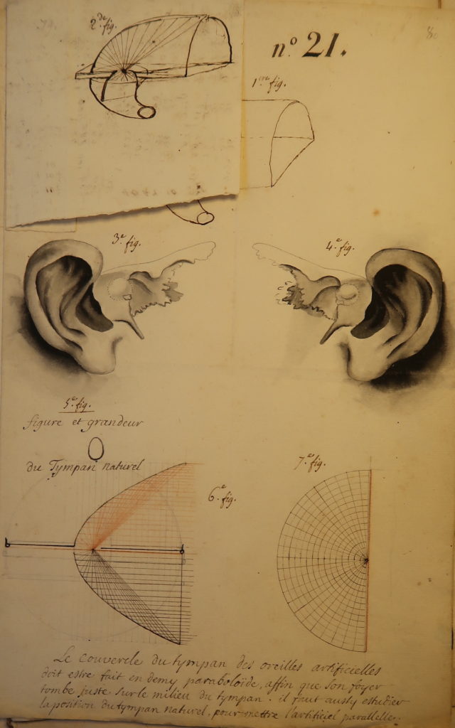
Père Sébastien Truchet (1657-1729) sought mathematical solutions to morphological problems. Whether his duty was to manage royal forests, design timepieces, or improve numismatic storage methods, his working notes are dominated by ruled lines and arithmetic formulae.[2] A Carmelite accepted to the Académie royale des sciences in 1699, Truchet is best known for having described a mode of pattern formation using bi-colored tiles. His faith that measurement and calculation could improve upon nature and resolve the world’s inherent disorder is particularly striking in his design for a hearing aid, a prosthetic tympanum he modeled on a parabola’s symmetrical slopes (Fig. 1).[3]
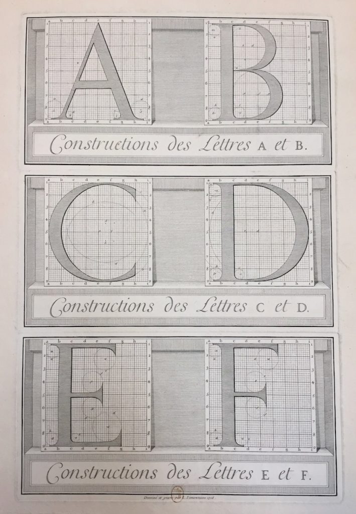
According to Truchet’s drawings, geometry could correct the human body’s irregularities and supplement its capabilities. When tasked with inventing a new typeface for Louis XIV, he adopted a similarly analytical approach by quantifying a practice traditionally guided by the artisan’s hands and eyes alone. Truchet plotted each alphabetic character on a grid of 2,304 tiny squares, establishing the proportions of each curve and serif—not with intuitive manual gestures, but with the exacting circuit of a compass (Fig. 2). This article shows how such technical, graphic directives were part of a broader effort by Louis XIV’s administration to supervise and coordinate artisans’ hands to project a political ideal: that of the King’s personal, all-pervasive command.
In addition to serving the Crown as an expert in hydraulics and horology, Truchet was a member of the Bignon Commission. Headed by the Abbé Jean-Paul Bignon (1662-1743), the satellite to the Académie royale des sciences was charged with two tasks: first, to write and illustrate a comprehensive description of French arts and industries, and, second, to design a new typeface fit for use at the Imprimerie royale. The typeface, known as the “Romain du roi,” was first employed in 1702 in a luxurious publication entitled Médailles sur les principaux événements sur le règne de Louis le Grand, although it took type engravers until 1745 to complete all twenty sizes of the font.[4] The enterprise to document the mechanical arts—the “Description des arts”—was never produced as the comprehensive “encyclopedic” publication the committee initially envisioned.[5] Only beginning in the 1760s, in the shadow of Diderot and d’Alembert’s Encyclopédie, did a serial version of their survey emerge as the Description des arts et métiers.[6]
Along with Bignon and Truchet, five other men met weekly at the cleric’s home to develop these projects: the savants Gilles Filleau des Billettes (1634-1720) and Jacques Jaugeon (1655-1724), the Imprimerie royale’s director Jean Anisson (1642-1721), the printmaker Louis Simonneau (1645-1728), and the type engraver Philippe Grandjean (1666-1714).[7] Beyond completing designs for the Romain du roi, the Bignon Commission made progress documenting one subject: the print arts. They began with this constellation of practices because, they reasoned, print was the art “that conserved all others.”[8] At the time their taskforce convened, print had already been firmly established as a truly modern technology, one that gave Louis XIV and the academics he sponsored a significant advantage over the ancients in their ability to preserve and disseminate information.[9] Paradoxically, Jaugeon’s lengthy illustrated tome on the print arts was never set in type. It exists only as a manuscript in his hand, with sections on alphabets, typography, type manufacture, letterpress, and intaglio printing.[10]
The activities of the Bignon Commission—from Jaugeon’s manuscript to Truchet’s ideas for the Romain du roi, the scattered contents of the Description des arts initiative, and the publication of the Médailles de Louis le Grand—have been well documented by André Jammes, James Mosley, Madeleine Pinault-Sørensen, and others. Despite the thoroughness of these sources, the committee’s corpus of notes and drawings has been largely overlooked in narratives that chart the representation of trades and tradesmen in the Ancien Régime.[11] Considerable scholarship has been devoted to interpreting the structure of the Encyclopédie and the visual rhetoric of its plates, and yet the illustrations on which it was modeled—those belonging to the Description des arts—have received less critical attention, with the exception of two interventions.[12] The first, by Geraldine Sheridan, emphasizes the “epistemological parity” between artisans and academics implied by the committee’s collaborative working mode. In light of these cooperative practices, Sheridan states that the innovative status bestowed upon Diderot and D’Alembert’s approach to extracting useful knowledge from craftsmen has been overstated.[13] The second, by Paola Bertucci, situates the Description des arts as a key predecessor of the Société des arts, which the author frames as an institution crucial to understanding the role the mechanical arts played in the Enlightenment pursuit of progress.[14]
This article considers what the Bignon Commission’s working archives reveal about the challenges of translating between embodied and page-bound regimes of knowledge in a unique moment of epistemic entanglement and technical transition. To do so, it will depart from previous studies of the group by surveying all its activities in concert. Examination of the Commission’s projects shows that royal orders for perfection in print and the mechanical arts forced disparate modes of making and knowing into contact. In the case of the Romain du roi, the extreme precision of its design placed hitherto unseen demands on the type engraver Grandjean, who found his hands directed by calibrations easy to theorize but difficult to execute at such a reduced scale. Surviving preparatory material from the Description des arts reveals unresolved understandings of artisanal labor, as expressed through Simonneau’s diverse modes of representing the body at work. Finally, the inclusion and subsequent erasure of artisans’ signatures in the Médailles de Louis le Grand convey anxieties around the visibility of craftsmen in these state-sponsored projects and a concern that identifiable vestiges of their handiwork might erode the univocal authority of print itself.
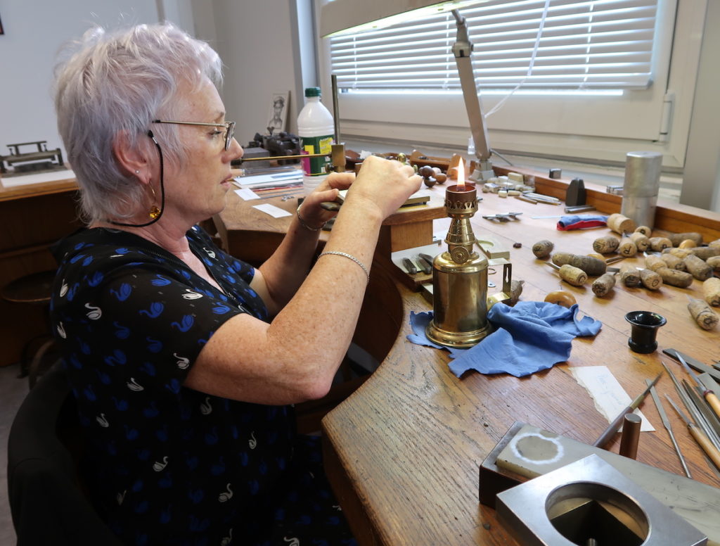
Drawing on approaches pioneered by historians of science such as Pamela Smith and adopted by art historians, this article attends to technical processes as a way to reconstruct how knowledge was made and deployed by the Bignon Commission.[15] This essay also insists, however, upon the limits of graphic and textual sources, which can only partially aid our understanding of artisanal practices. As art historian Anne-Sophie Lehmann has articulated, “The complexity of making challenges our most important analytical tool: written language and its essentially linear structure.”[16] As an antidote to this incommensurability—the same one authors of the Description des arts and the Encyclopédie faced—I also consulted a practicing type engraver as part of research for this article. Master artisan Nelly Gable—Grandjean’s current successor at the Imprimerie nationale—generously allowed me to observe her and her colleagues at work in their atelier in Douai, where type bodies used to print the Médailles de Louis XIV are still held.
Driving this approach is the following question: what significance might be gleaned from the very processes by which a typeface or an illustration of typecasting is made? That savants working for Louis XIV sought to perfect the perceptible form of words—type—and not just the conceptual contents they were made to carry—language—suggests that texts printed for the King were understood to exceed their denotative function.[17] Bibliographer Donald Francis McKenzie proposed that in book printing, the “authorial control of the physical forms makes manifest the [Platonic] ideal, one in which the essence of a work’s meaning is distilled in the detail of its formal presentation.”[18] This postulate merits exploration in the case of the Bignon Commission, which oversaw intersemiotic translations between verbal (academic) and nonverbal (artisanal) signs throughout its projects.[19] Transmuting an ethos of absolute rule into type required the vigilant oversight of craftsmen and their bodies. And yet scrutiny of how this translation was exercised reveals both the innovations and limitations of such reifying procedures in print.[20] A closer look at how the Romain du roi, the Description des arts, and the Médailles de Louis le Grand were made sheds light on the mechanics of scaling political ideals, and of the potential threat to authority posed by multiplying the unique traces of the artisan’s hand through reproductive measures.
Directing Hands for the Romain du Roi
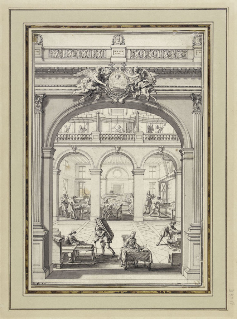
An anonymous drawing from the end of the seventeenth century depicts an idealized version of the Imprimerie royale, then housed at the Louvre (Fig. 3). One man delivers paper, other figures set type, and a pair passes lines through the press while above them workers hang sheets to dry in the rafters. Crowning this display of the print process, a Latin device announces the purpose of their collective labors. Penned above a symbol of the Sun King is the motto “servat et auget” (“preserve and augment”): the Imprimerie royale’s duty was to conserve Louis XIV’s glory for posterity and enhance its prominence through the reproductive power of the press.[21] Given this charge, it was essential that the typeface used to print royal publications reflect the order and modernity of the King’s reign. The sixteenth-century characters still in use were deemed inadequate, and the Bignon Commission received orders in 1694 to add the invention of a new typeface to its list of duties.[22]
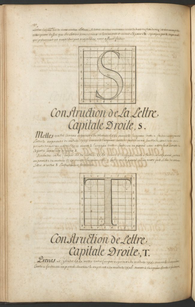
In designing characters for Louis XIV, Truchet and his colleagues sought to make them perfect in their internal proportions and perfectly scaled across point sizes.[23] To achieve the former, Truchet studied the finest printed volumes and French and Italian calligraphy samples held in the King’s library, and his observations likely inspired the Romain du roi’s smooth curves and thin serifs.[24] At the same time, the typeface abandoned some notable characteristics of handwriting with its insistent verticality and departure from the “sloped and bracketed serifs that derived from obliquely-stressed pen forms.”[25] Thus, the style of the Romain du roi at once mimicked the traces of the human hand and distanced itself from such affinities. This detail from Jaugeon’s manuscript—the pages of which are peppered with holes from a compass needle—outlines and illustrates how to construct an “S” for the Romain du roi by plotting it on a grid (Fig. 4). His drawings of letters show how their contours were prescribed by the radii of overlapping and tangent circles. Although largely inspired by the silhouettes of handwritten letters, the King’s new characters were designed to be immune from any idiosyncracies the human hand might introduce.
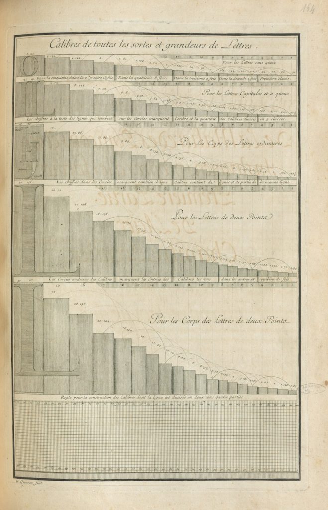
In addition to modernizing the appearance of roman letters, the committee also theorized the first-ever standardized type by calculating an ordinal, interrelated set of type bodies.[26] These letters would maintain their internal proportions as one ascended and descended in point size with groundbreaking regularity and precision. Each body size would increase in an arithmetic progression, as G. Quinault’s engraving illustrates (Fig. 5).[27] In the process of coming up with this system, Truchet measured existing type samples with a microscope, intent on identifying an established standard of bodies. Finding no satisfactory precedent, he based a new system on a fantastically small unit of measure: 1/204 of a ligne, or 0.011057 mm.[28] In his manuscript, Jaugeon furnished a table displaying the proportions of the new system and explained the program’s utility (Fig. 6):
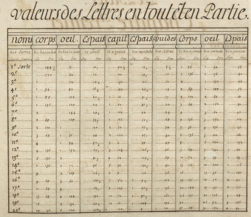
We have given an exact table of the proportions of the different sizes of letters, which are normally called ‘bodies’, where it can be seen that […] each body bears the same relationship with that which follows or precedes it, which in addition to promoting an agreeable regularity, will in the future be to the advantage of printers.[29]
To appreciate the innovations Truchet and his colleagues pioneered with the Romain du roi, some understanding of early modern type design and production is necessary.
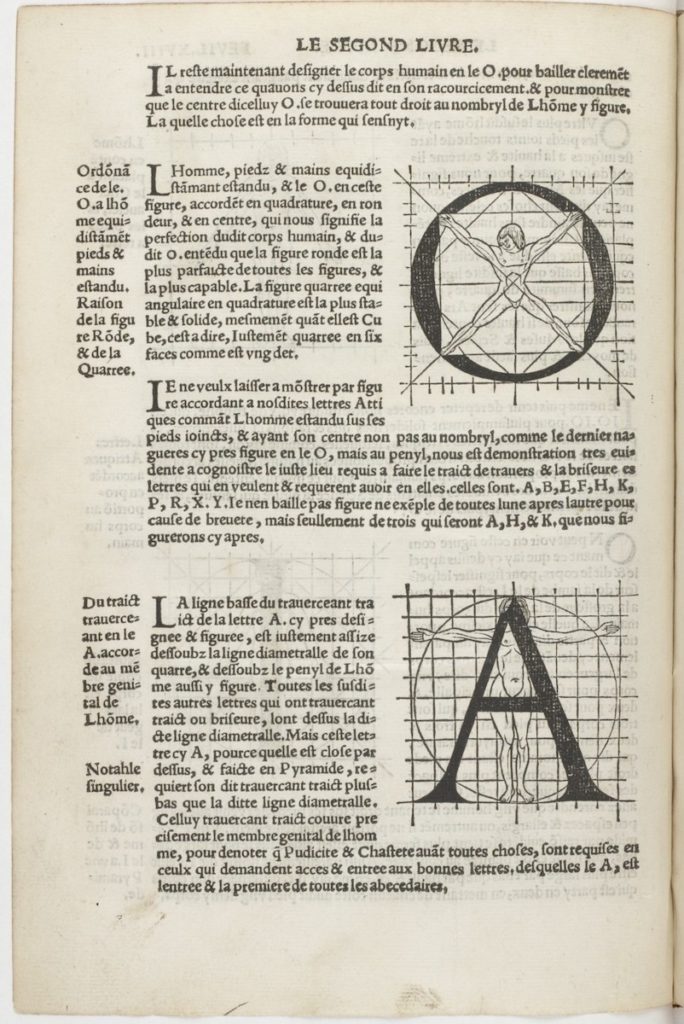
Since the advent of the printing press and the moveable type it employed, typefaces have been conceived of in terms both bodily and geometric. For example, Albrecht Dürer subjected the human form and Latin alphabet alike to proportional analysis, and in his manual Champ Fleury (1529), Geoffroy Tory based many of his letters on Vitruvian figures graphed inside ten-by-ten grids (Fig. 7).[30] A letter’s proportions were informed by those of the ideal human body, a Humanist rationale that has left its mark in the anthropomorphic terms still used to describe the various parts of a typographic character: the hollow in a “p” is an “eye,” its descender a “tail,” and its lowermost serif a “foot.” Within a piece of type, the “face” of the letter stands out in relief from the “body” that supports it (Fig. 8).
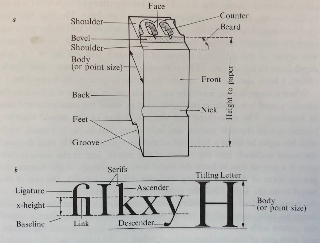
In the field of typography, bodies—both those of the artisans who make type and those of the letters they produce—are governed by measurement. This is because the process of setting type for print demands that each unit be precisely calibrated, not only in the proportions of its “face,” but also in the dimensions of its “body.” Compositors set letters snugly together in tightly stacked rows, and for this reason, the height to paper and body height of pieces of type must be uniform if they are to form an even string of text. Identical height to paper measurement ensures that pieces of type meet the page with the same pressure, and identical body height guarantees that characters are of the same size and aligned.[31]
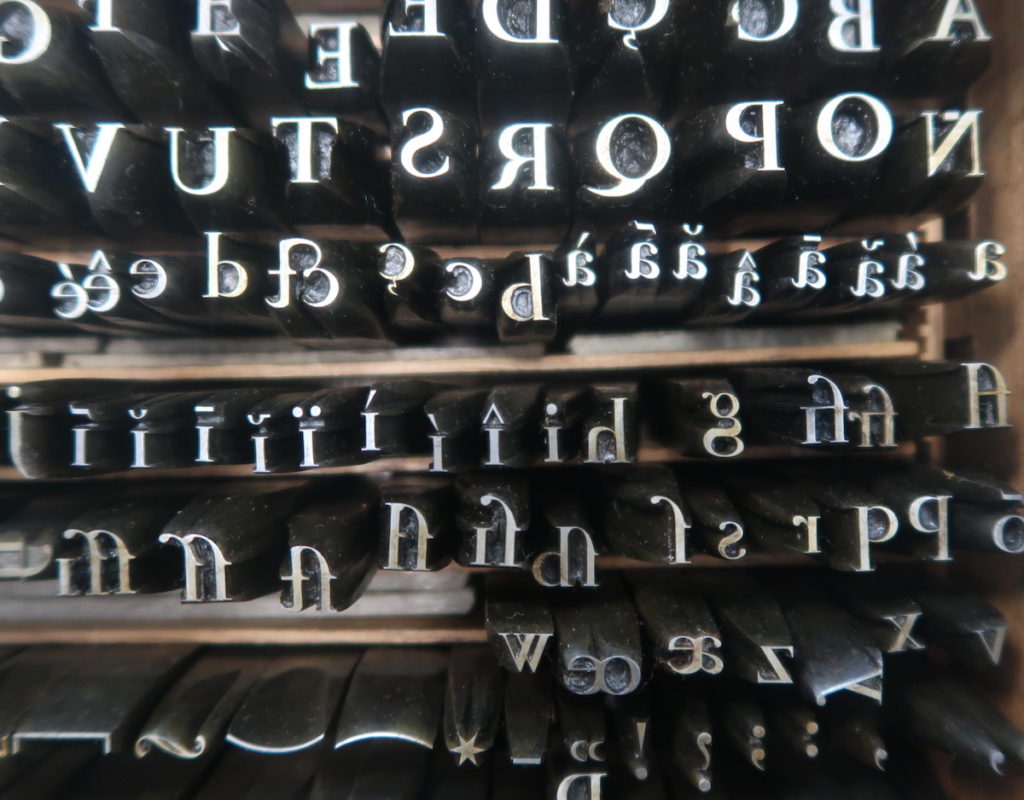
To make type, letters are fixed in standardized chunks of obdurate metal. This entails a three-part process (Fig. 9-11). First, a skilled punchcutter engraves a letter in reverse and in relief on the end of a steel rod, called a type punch (“poinçon”). Second, a mold is created from this unique letter by tempering the type punch to harden it and striking it into a justified piece of copper. The dimensions of this matrix ultimately determine the size of the type body. This counterpunch (“contrepoinçon”) is then used to cast the many pieces of type needed for the letterpress. These pieces are forged by pouring a molten alloy into a handheld mold that secures the counterpunch in place, and the solidified pieces of type that emerge from the device are then trimmed and polished.
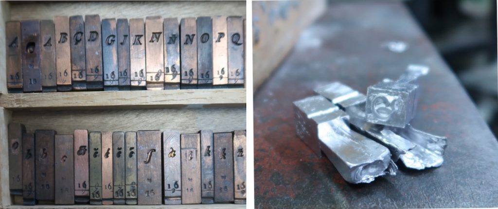
RIGHT: Fig. 11. Cast pieces of type prior to jet removal, Cabinet des poinçons de l’Imprimerie nationale, Douai. Photo by author.
During every step of this process, artisans work with the greatest possible precision, for the most minute error can lead to a character’s total disfigurement. There is an inherent disjunction between the scale of the craftsman’s gesture and the degree to which it alters the integrity of the final letter. Meditating on this phenomenon, type engraver Nelly Gable describes her perception of the forms that emerge from her handheld tools as “monumental.”[32] Observed through her magnifying lens, the smallest scrape of a file substantially alters a letter’s character.
Before the invention of the Romain du roi, the costly production of type was overseen not by academics, but by print professionals. According to the English printer Joseph Moxon (1627-1691), type engraving was a secretive practice, one insulated from the geometer’s logic. In his serial treatise on the industrial arts, Mechanick exercises (1683), he wrote of punchcutters, “[…By] the appearance of some Work done, a judicious Eye may doubt whether they go by any Rule at all […]”[33] Before elaborating a set of geometric principles for the benefit of the tradesmen, he mused, “Geometricians will censure me for writing anew that which almost every young Beginner knows: And Letter-Cutters will censure me for proposing a Rule for that which they dare pretend they can do without Rule.”[34]
Moxon’s articulation of an epistemological abyss between artisan and academic was by no means isolated. Barbs were hurled both ways. Decades later, punchcutter Pierre-Simon Fournier the Younger derided the feasibility of the Bignon Commission’s project in his Manuel typographique (1764). In the spirit of defending his own artisanal expertise and in reference to Truchet’s 2304-square grids, he balked, “These rules bring us to the idea of the infinitely small, where only the imagination can reach […] Need we so many squares to form a round O?”[35] Historians of type have categorized Fournier’s comments as rearguard, but the impossibility of following Truchet’s instructions was a real challenge.[36]
Truchet’s tables and Jaugeon’s diagrams seem not to account for the difficulties a craftsman might encounter translating graphic instructions with a type engraver’s tools at a greatly reduced scale.[37] On two occasions in 1697, Grandjean had to “break” all characters he had engraved to remake them “of a more exquisite perfection still,” he noted. He spent three months striking, restriking, and justifying copper matrices from these punches, and he actively tried to improve the mechanical precision of his procedures. According to his notes, he invented a new machine to hammer matrices and introduced various tools to achieve “proportioned equality,” “greater precision,” and “regularity.” He even proposed an invention for a compass that could divide lines “to infinity that would serve to verify letter bodies at the Imprimerie royale.”[38] Grandjean’s records show that ultimately, producing the Romain du roi was a more experimental and hand-guided process than the savants’ diagrams and Truchet’s calculations anticipated. Grandjean’s memoirs also indicate that knowledge of tools and how to make them was essential to improving the precision of industrial processes, and that Grandjean—an artisan—was a key facilitator in these improvements.
Jaugeon and his fellow academicians had to accede, in the end, that the art of the type engraver could never be fully reduced to geometric parameters. “It is true,” he wrote, “that it is difficult in the construction of punches […] to capture precisions justly; the eye of the worker must also determine them.” Jaugeon continued to warn of the subjectivity of the artisan’s eye, advising “that [the punchcutter] take care that his vision faithfully see objects as they are.” Not only was sight itself suspect, but one must watch out for the artisan’s “desire to distinguish himself and appear more accomplished than his masters, that it not carry him away to imagine changes that might disfigure the character.”[39] In his mind, the type engraver’s charge was not to exhibit creativity, but rather, to dissimulate the singularity of his hand and the unique viewpoint that guided it.
Nevertheless, Jaugeon admitted that Grandjean brought something ineffable to the Romain du roi, something that could not be described by diagrams, formulas, or even his own words. He noted that,
[…E]xperience has shown us that it is not so much the pleasing quality of each separate part that constitutes the excellence of characters, as the rapport between the parts themselves, that is to say those who execute them depend most often on a certain ‘je ne sais quoi’ that one feels but about which one would not know what to say, yet one grasps without knowing it that one hardly ever finds [this quality] in a point.[40]
Jaugeon confesses that ultimately, the beauty of a piece of type could not be reduced to a system of mathematical “points.” In the magnified, theoretical realm of the page, each part of a letter could be tweaked until consensus was reached by multiple academic observers. In this way, how the Romain du roi was designed reflects the comprehensive administration that Louis XIV and his ministers had put in place.[41] When it came to the design’s execution, however, administrative oversight and the geometric principles that assured it lost their reach, and only one hand could direct the letter’s appearance. At the scale of the type body, the individual punchcutter became the sole figure of authority.
Further on in his manuscript, Jaugeon explained that the praxis-driven optical adjustments Grandjean implemented were especially important when it came to executing different point sizes. Though perfectly scalable in theory, the proportions of Truchet’s geometrically-generated letters had to be slightly altered at different sizes for a character to remain legible.[42] The success of a set of characters depended not on their individual fidelity to a diagram, but on their harmonious relationship to each other. It is tempting to use this accord between characters as a metaphor for the exchanges that took place between academic and artisanal members of the Bignon Commission, and for the subtle adjustments and compromises that facilitated their collaboration. Images associated with the Description des arts and the publication history of the Médailles de Louis le Grand show, however, that exchanges between craftsmen and savants were troubled by issues of authority and authorship.
Representing Hands in the Description des Arts et Métiers
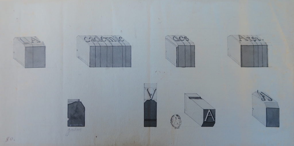
Pasted into an album at the Bibliothèque de l’Arsenal alongside other prints and drawings for the Description des arts, this image depicts pieces of type from different angles and aligned to form a phrase (Fig. 12). In reality, letters appear in reverse on type bodies and compositors spell words from right to left. That this drawing’s anonymous artist reversed the characters’ orientation suggests it was made for interpretation in print. The letters spell out “LA cademie des Arst,” a scrambled version of the title des Billettes considered bestowing on his committee. So precise and finished is the drawing that the flipped “s” and “t” appear intentional. The inversion may allude to errors authors feared might transpire at the typesetter’s table, where the tradesman’s hand could betray the writer’s words.[43] Such risks of miscommunication were embedded in the Bignon Commission’s operations,in which academics directed and recorded the physical activities of artisans.
Early in Louis XIV’s reign, savants and statesmen considered establishing a multidisciplinary institution that would encompass all areas of knowledge. Around 1663, Christiaan Huygens (1629-1695) proposed that the French crown establish a royal “Company of the Sciences and of the Arts.” Its purpose would be to improve the mechanical arts, infrastructure, and natural resource extraction to bring greater “utility and comfort” to France. To succeed in these endeavors, the Company would employ new scientific instruments and the “secrets” guarded by artisans.[44] In 1675, architect Claude Perrault (1613-1688) read Jean-Baptiste Colbert’s proposal to his colleagues at the Académie royale des sciences to launch a treatise describing all machines useful to art and industry in France.[45]
Both Huygens’ company and Colbert’s treatise failed to attract sufficient enthusiasm, however, and it was not until the 1690s that the Bignon Commission picked up the mantle of these stalled enterprises. When the savants first assembled, des Billettes entertained the idea of adopting the formal title Académie des arts, though the group never achieved this independent status. Moreover, its members were not accepted to the Académie royale des sciences until 1699—and only then as “méchaniciens”—and their reports on the “description et perfection des arts” elicited a lukewarm reception at academy meetings.[46] The insufficient institutional support their study of trades received reflects ambivalence around devoting intellectual attention to the documentation of manual pursuits.[47]
On the one hand, the mechanical arts benefitted from a boost in status in the late seventeenth century thanks to the Quarrel of the Ancients and the Moderns. Partisans of the Modern camp, such as Charles Perrault (1628-1703), heralded artisans’ useful knowledge as key to the present’s unparalleled progress.[48] On the other hand, those who wrote about the mechanical arts remained frustrated by what they perceived as craftsmen’s inability to articulately explain their work. Royal historiographer of buildings André Félibien (1619-1695) lamented in 1676, “[…] For it is often that Workers do not execute things as we imagined […] for they do not speak in a language we understand well.”[49] In the Encyclopédie’s “Prospectus,” Diderot filed similar complaints against the “blind, mechanical instinct” of the craftsman, concluding that often, the only way to understand a tradesman’s maneuvers was to “put one’s hand to work” oneself.[50] As Barbara Maria Stafford has argued, “physical images and organic bodies necessarily expressed themselves differently from sequential texts […] since their nature was precisely to make manifest that which could not be said.”[51] In describing and illustrating the arts and industries of France, the Bignon Commission had to confront this contrast in expression and terms.
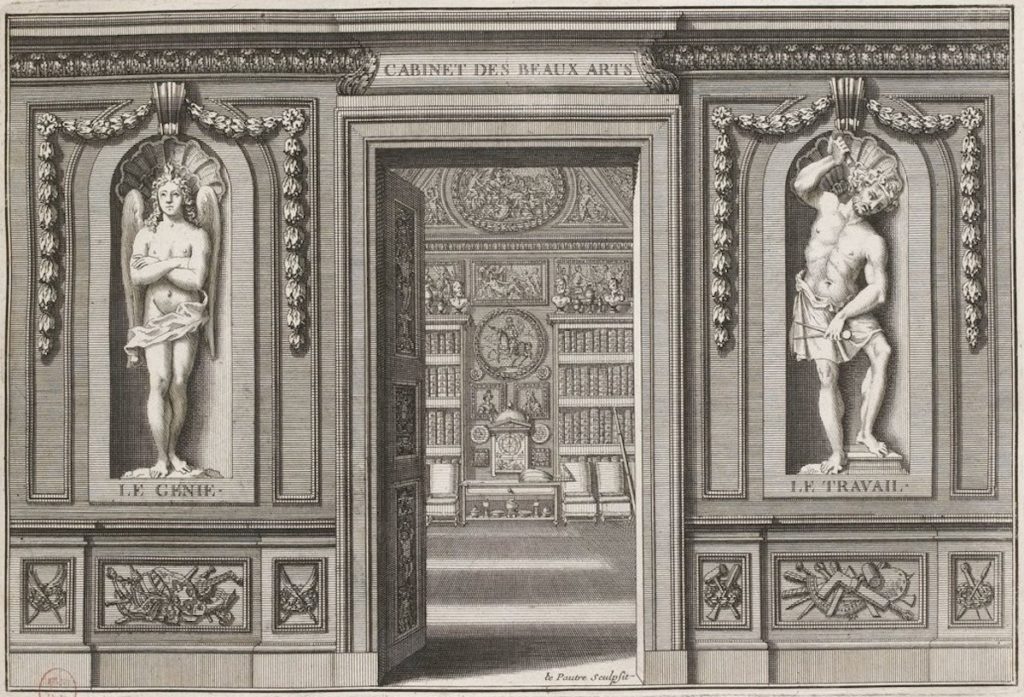
Charles Perrault insisted upon the mechanical arts’ utility, defining them in contrast to liberal pursuits. The complementary distinctions he perceived are captured in the frontispiece to his Cabinet des Beaux-arts (1690), a volume of prints that reproduced the allegorical ceiling paintings of arts and industries he commissioned for his home (Fig. 13).[52] Engraved by sculptor Pierre le Pautre, the opening to the recueil shows two sculptures flanking the entry to Perrault’s cabinet. On the left stands placid, cerebral “genius” (“Génie”), a flame of inspiration burning above his head. To the right, muscular “work” (“Travail”) stands akimbo, his limbs as sharply angled as his tools. While the Vulcan-like figure of labor looks ready to burst from his niche, Génie’s arms are folded in pensive immobility.
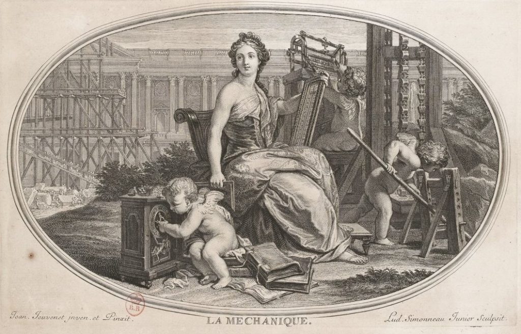
Among the “beaux-arts” subjects featured in Perrault’s cycle is La Méchanique. In Simonneau’s print after Jean Jouvenet’s painting, one busy putto captures the same brute effort exhibited by Travail in his activation of a water pump (Fig. 14). Another tinkers in the foreground, displaying a craftsman’s embodied, ever-responsive approach to making scientific instruments. Square and thermometer in hand, the main figure shows the importance of measurement in the mechanical arts. As Travail and Génie are shown as equal pillars in the achievement of the arts, Jouvenet’s figures demonstrate the myriad ways the body could exercise knowledge. In his commentary, Perrault insists upon the capacity of La Méchanique to shape matter through physical intervention, writing that it does “in reality and in truth all that most of its fellow arts do only by allusion and metaphor.”[53] Through this statement, Perrault highlights his investment in the transformative power of instruments and their technicians. The creation of the Romain du roi can be viewed in these terms, as the manifestion of “allusion and metaphor” by mechanical means.
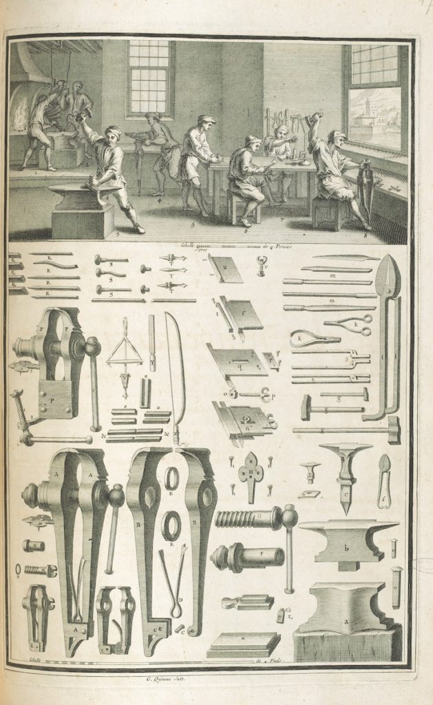
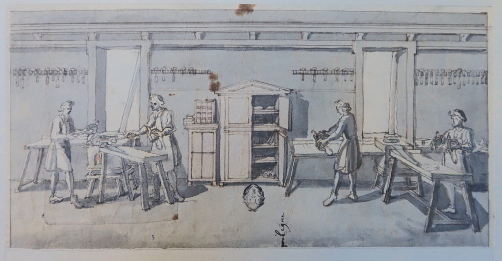
Throughout the prints of artisans at work made for the Description des arts, engravers Simonneau and G. Quinault often fix figures in the hyperkinetic manner exhibited by the engraved sculpture of Travail, thus signaling the distinctly physical nature of the workshop (Fig. 15). Images featuring raised arms and brute displays of strength prefigure Diderot’s later definition of “métier” (“trade”) in the Encyclopédie: “One gives this name to every profession that demands the use of the arms, & that is limited to a certain number of mechanical operations, which have as their aim the same object, that the worker repeats without ceasing.”[54] In Simonneau’s working drawing of a typefounder’s studio, each featureless worker occupies a fixed station, suggesting conditions of rote repetition (Fig. 16). The configuration is, in part, didactic, a way to show each step, from casting to polishing, of typecasting. In this way, it sets the standard for what Roland Barthes identified in the Encyclopédie plates as the breaking apart of synthetic processes into a system of isolated, irreducible signs.[55] Prints from the Description des arts and their imitators thus project a fictional command of the means of visual representation, not unlike the exaggerated authority conveyed by prints illustrating the Romain du roi’s construction.
By only considering the final, published prints, analyses of the split-composition plates typical of the Encyclopédie and the later Description des arts et métiers ascribe a disproportionate degree of certainty to their authors and illustrators. Such assessments set printmakers in trenchant opposition to the embodied knowledge of the atelier, when in fact Simonneau’s drawing process was more like that of making the Romain du roi type punches: an evolving, responsive exchange between artisan and academic, hand and mind. Tucked away in folders, often in fragments,and rarely, if ever, reproduced, Simonneau’s drawings not only document the work of the artisan; they also document the work of the scientific illustrator. Combining the techniques of both bricoleur and engineer, Simonneau’s depiction of typefounding contains, like so many of his drawings, annotations and corrections. Its illuminated forge, for example, is a pasted addition.[56]
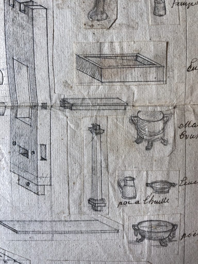
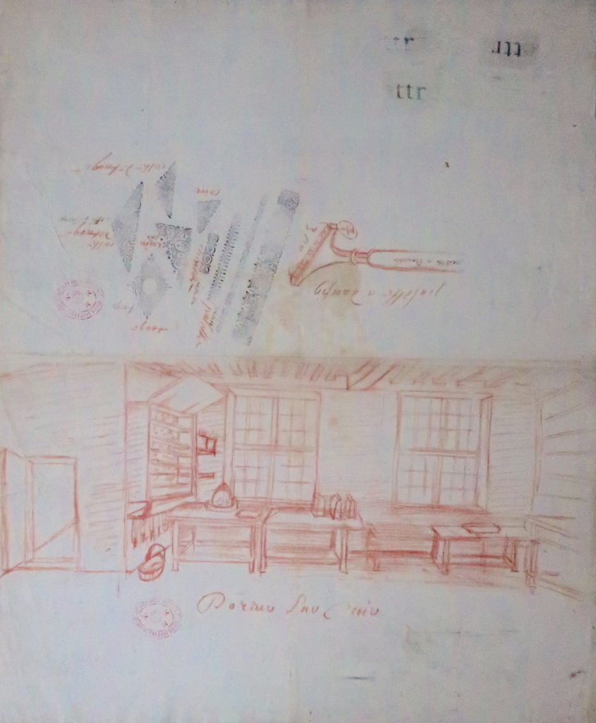
In Simonneau’s sketches for the Description des arts, the abstract plane of the diagram and the rational space of the workshop are regularly interrupted by cut-outs and glued-on scraps of paper jostling for space (Fig. 17). These vestiges of the artist’s process testify to the numerous artisanal operations Simonneau observed and was at pains to make legible. The composition’s divided structure—now an icon of Enlightenment reason—emerged, in part, from the draftsman’s practical use of paper, a surface on which he accumulated multiple observations and vanishing points. This instability of scale, figure and ground, depth and surface, is also apparent in Simonneau’s study for the art of leather tooling and gilding. In the space above his red crayon sketch of the atelier, the draftsman supplements his drawing of a curved rocker (pallet) with direct impressions from the artisan’s decorative metal stamps (Fig. 18). Above, the characters “ettr” (possibly from the word “lettre”) are impressed on the page, tactile tokens of the bookmaking process and an index of a mechanical procedure by which words become print. Here, Simonneau did not just take his hand to the machine, as Diderot claimed to do; he took the artisan’s tool directly to paper, thus temporarily mitigating any need for translation.
Simonneau’s inclusion of found text and decorative fragments highlights how the diagram was constructed through the artist’s subjective additions and ommissions. The processes of assemblage and accumulation that underly the plates of the Description des arts thus constitute a sort of material heteroglossia, one that fractures the synoptic vision asserted by the central perspective of the upper vignettes, a sightline that might otherwise project “the privileged status of supervision.”[57] A look at these working drawings shows how in large, sweeping projects, the management of parts often subtends the fabrication of an authoritative whole. In the publication process, the piecemeal nature of these images is occluded, smoothed over in the unifying plane of the copper matrix. This gives a rational, unified front to these depictions of manufacturing, and to the royal institutions that documented them. The printing of the Médailles de Louis Le Grand also required the orchestration of many moving parts, from Romain du roi type to intaglio copper plates in various sizes. As the following section shows, the harmonious merger of these parts also required editorial acts of elision.
Erasing Hands in the Médailles de Louis le Grand
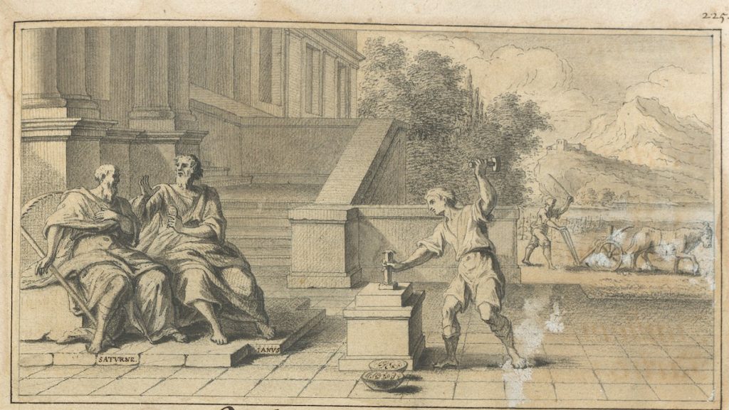
In the vignette crowning Jaugeon’s chapter on type engraving, a man strikes coins, his posture akin to Perrault’s figure of Travail and Simonneau’s artisans (Fig. 19). A farmer in the background echoes the worker’s strain, his raised switch a transposition of the cocked hammer. The parallel between workers’ bodies is reinforced by the figures coupled at left: sickle-bearing Saturn sought asylum in Janus’ home of Latium, where he taught his host the secrets of agriculture in exchange for refuge. The Roman god of thresholds and transitions, Janus is often depicted as having two faces, like the coin he holds in his hand. In his introduction, Jaugeon identifies Janus as the inventor of money, and type engraving as the descendent of this ancient art. Like coins and medals, type would preserve words and their narratives for “posterity,” the savant claimed.[58]
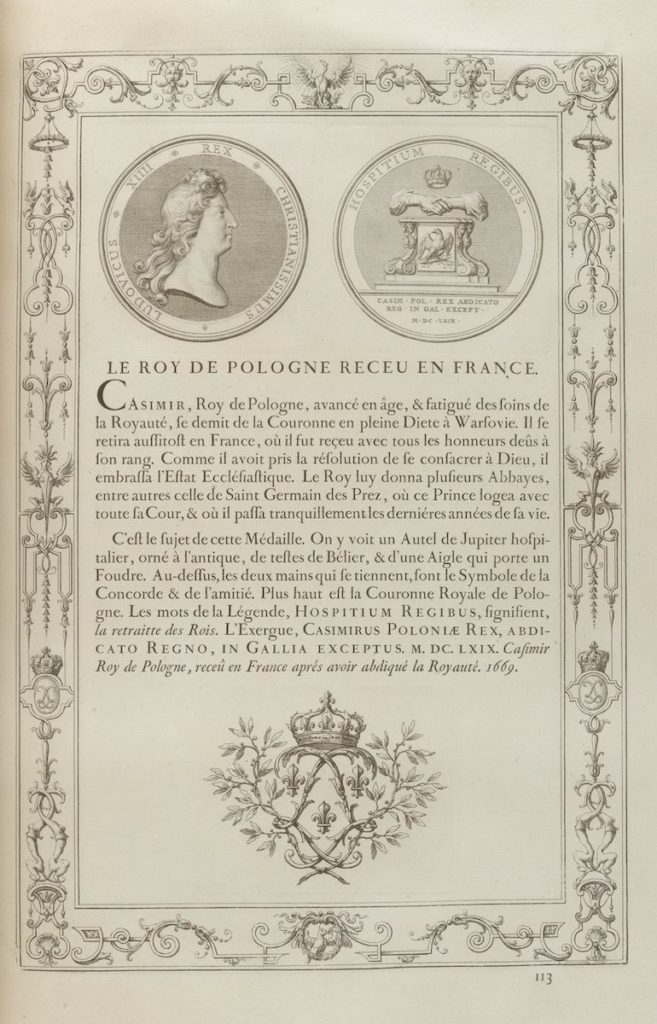
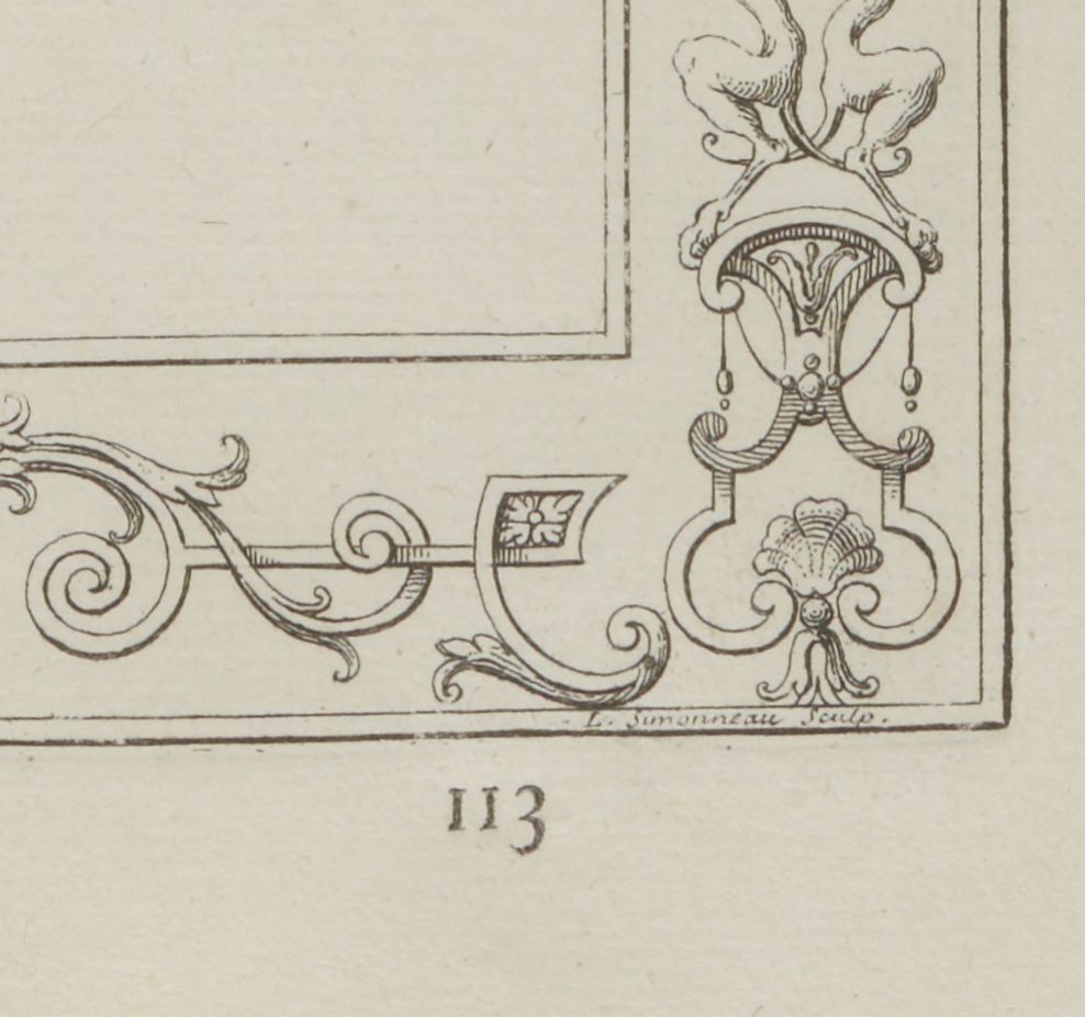
As with the medals it reproduced, the Médailles de Louis le Grand’s purpose was to record the King’s accomplishments for future generations of numismatists, now via the modern medium of print.[59] The product of years of collaboration between the Petite Académie, the Imprimerie royale, the Bignon Commission, printmakers, and medal engravers, the book was a technical masterpiece. Every page of the luxurious folio edition includes etched representations of each medal’s obverse and reverse, a written description set in Romain du roi type, and a fleuron, all framed by a decorative bordure (Fig. 20). Simonneau was responsible for etching the twenty-eight ornamental border plates designed by Jean Bérain. Early proofs of the volume show that originally, the printmaker’s signature was visible on the bottom edge of each plate.[60] In official editions however, the plates were cut down, such that Simonneau’s name was excised from the matrices and their impressions. The frames were intended to be a harmonizing element, one that made the pages cohere like ordered type, and within this scheme, there was no place for an individual to distinguish himself. In apparent rebellion against this exclusion, the printmaker reinserted “L. Simonneau Sculp.” and the initial “L.S.” in the foot margin of several plates, an assertion of authorship that can still be detected in certain surviving sheets (Fig. 20a).
Just as the visibility of Simonneau’s authorship was diminished, so too was that of those who engraved the dies used to strike the King’s medals. Die engravers’ names were visible on the surface of the obverse of medals, but in the Médailles de Louis le Grand, the signatures of these craftsmen are eliminated. The printed engravings were likely based on the drawn designs executed by Antoine Coypel and Sébastien Leclerc rather than on the medals themselves, which partially explains this omission.[61] Nevertheless, the absence of the engravers’ names is part of a systematic refusal throughout the Médailles de Louis le Grand to ascribe credit to artisanal authors.
Nowhere is this more obvious than in the suppression of the original preface, which can be found in only a handful of surviving editions.[62] In the vast majority of copies, it has been redacted. The running theory as to why this occurred was that its author gave too much credit to the artists and artisans who helped make the volume, listing participants such as Simonneau and Grandjean by name. Given that this publication was intended to unite the King’s accomplishments in a collectible history of which the sovereign was sole author and actor, diverting attention to artisans jeopardized the univocal authority of the publication. Overexposure of the artisanal processes by which this narrative was fabricated would threaten the miraculous force of what Louis Marin has described as a “homogeneous corpus of metallic history totalizing in its volume the glorious body of the king.”[63]
As Marin observed in the case of Louis XIV’s royal spectacles, their dazzling impact depended on the “dissumulation of the operation(s)” that set them in motion.[64] Similarly, the Romain du roi, the Description des arts, and the Médailles de Louis le Grand featured artisanal excellence at the same time as they sublimated discrete bodily gestures into print bodies that appeared geometrically, intellectually, and formally unified. Whether measuring bodies of type or charting the bodies of craftsmen, the Bignon Commission’s objective was to bring a new degree of order and coherence to the mechanical arts. The administration’s reluctance to attribute agency, allow creativity, or bestow authorship on artisans implies a desire to sever processes of conception from those of execution within these pursuits.
In this way, the manner in which the Bignon Commission engaged with craftsmen marks an experiment in management, for their unprecedented collaboration also lays the groundwork for a split that would come to define the mechanical arts at an even greater scale: the systematization and mechanization of craft knowledge, and the division of labor this facilitated.[65] If the curve of an “O” could be convincingly mapped with a known quantity of squares and the work of the type engraver described and diagrammed in the academic’s authoritative language, then the artisan’s hand risked obsolescence. This is not to argue that the Bignon Commission marks a turning point in a march towards industrialization, nor is it to participate in theories of the emergence of capitalism under Louis XIV.[66] However, as issues of artisanal authorship and anonymity in these related projects reveal, coordinated adherence to a prescribed artistic program served a political imperative. The power projected by the texts printed for Louis XIV required the evocation of a sovereign hand. In the case of Grandjean’s work, this meant departing at times from the committee’s geometric instructions, and in the case of Simonneau, this meant building up a seamless illustration from irregular parts. The artistic and artisanal processes by which the Bignon Commission’s directions were executed thus reveal both advances precipitated by and limitations encountered in the improvement of the print and mechanical arts under Louis XIV. By comparing the savants’ totalizing ambitions to the objects themselves, a gap is revealed between dreams of frictionless projection and the intractable constraints of the early modern workshop.
Descender
Nelly Gable is a master type engraver and conservator of the Imprimerie nationale’s collection of copper matrices and poinçons, which include Grandjean’s punches and Simonneau’s decorative borders (Fig. 21). In February 2018, her embodied knowledge was deemed part of France’s intangible cultural heritage (“patrimoine culturel immatériel”), a designation introduced by UNESCO in 2003. A condition of her induction into the official French rank of “master artisan” was the transfer of this “intangible” knowledge to an apprentice. Gable and her student, Annie Bocel, were inspired to preserve and share the process by which this knowledge was imparted, and so, with financial support from the Institut national des métiers d’art, they published Dessins de geste: gravure & poinçon typographique in 2019.[67] Bocel provided the illustrations, and Gable the explanatory texts. In her introduction, Gable wrote on the tradition of type engraving that “Knowledge and techniques have always been transmitted orally and even today cannot be transmitted solely and fully by way of a book.”[68] Despite admitting to the limits of the inert page to capture their animate skills, the two seized the opportunity to represent their craft, engaging both their minds and hands in the process.
Sarah Grandin is a PhD
candidate in the History of Art and Architecture at Harvard University, where
she specializes in Ancien Régime print and decorative arts
Acknowledgements: This article began as a paper in the panel “Art and Political Authority in the Long Eighteenth Century,” chaired by Aaron Wile and Meredith Martin at HECAA at 25. I thank them and Amy Freund for the opportunity to share and develop this work. The recommendations of two anonymous reviewers and the editors of Journal18 greatly improved this paper. I must also extend thanks to archivists at the Institut de France and the Archives de l’Académie des Sciences for their help along the way, and to Nelly Gable, for welcoming me into her workshop.
[1] Henri Focillon, “In Praise of Hands,” The Life of Forms in Art, trans. Charles Beecher Hogan and George Kubler (New York: Zone Books, 1989), 157.
[2] Paris, Archives nationales, M//802 , M//803, and M//849-855.
[3] Madeleine Pinault, Dessin et Sciences: XVIIè-XVIIIè siècles, exhib. cat. (Paris: Éditions de la Réunion des Musées Nationaux, 1984), 65.
[4] I will henceforth refer to this publication as the Médailles de Louis le Grand.
[5] Des Billettes began his first set of undated notes for a preamble to the Description des arts: “Un traité des arts tres exact seroit presque une espece d’Encyclopédie […],” Untitled document 1, n.d., Procès-Verbaux des Séances de l’Académie royale des Sciences, vol. XIII, in the supplement Des Seances de l’Année 1695, jusqu’en 1696, Paris, Archives de l’Académie des Sciences, 154v. The full text is transcribed in Claire Salomon-Bayet, “Un préambule théorique à l’Académie des Arts. Académie royale des sciences (1693-1696). Présentation et textes,” Revue de l’histoire des sciences et de leurs applications 23:3 (1970), 229-250.
[6] For an overview of the drawings and prints produced in association with the Description des arts, see: Martine Jaoul and Madeleine Pinault, “La Collection ‘Description des Arts et Métiers’. Étude des sources inédites de la Houghton Library Université Harvard,” Ethnologie française 12:4 (1982), 335-360; Pinault, Aux sources de l’Encyclopédie: la Description des Arts et Métiers, 4 vols. (thèse de doctorat, L’École pratique des Hautes-Études, 1984); Pinault, “Dessins pour un Art de l’Imprimerie,” Congrès national des Sociétés savantes, Lyon, 1987, Histoire des Sciences, vol. II, 73-85. For a summary of the publication’s revival as monographic treatises in the 1760s, see: Arthur H. Cole and George B. Watts, The Handricrafts of France. As Recorded in the Descriptions des Arts et Métiers, 1761-1788 (Boston: Baker Library, 1952); Charles Coulston Gillispie, Science and Polity in France: The End of the Old Regime (Princeton: Princeton University Press, 2004), 337-355.
[7] Brief biographies of the participants are included in the notes of André Jammes, La Réforme de la Typographie Royale sous Louis XIV: Le Grandjean (Paris: Librairie Paul Jammes, 1985), 35-36.
[8] In his undated inventory of completed plate illustrations, Truchet wrote, “Nous mettons dabord dans cet arrangement les planches des arts qui doivent le plus servir a conserver les autres à la posterité comme sont l’imprimerie et la graveure.” Disposition et arrangement de quelques unes des Planches des arts et metiers qui ont esté dessinées et gravés par Louis Simonneau, n.d., Paris, Archives nationales, MM//849, liasse 8. Des Billettes used similar language in his unpublished preamble to the Description des arts. Untitled document, n.d., Procès-Verbaux des Séances de l’Académie royale des Sciences, 156v.
[9] Oversight of the print project known as the Cabinet du Roi and investment in the Bibliothèque du Roi reflect the stock the administration placed in print as a political instrument. See André Jammes, “Louis XIV, sa Bibliothèque et le Cabinet du Roi,” The Library 20, 1 (1965), 1-12; Marianne Grivel, “Le Cabinet du Roi,” in Jean-Gérald Castex, ed., Graver pour le roi: Collections historiques de la Chalcographie du Louvre, exhib. cat. (Paris: Lienart, 2019), 21-31.
[10] Jacques Jaugeon, Description et perfection des Arts-et-Métiers, Tome I. Des arts de construire les caractères, de graver les poinçons de lettres, de fondre les lettres, d’imprimer les lettres et de relier les livres, 1704, Paris, Bibliothèque de l’Institut de France, Ms. 2741.
[11] This is but a selection of scholarship on the Encyclopédie plates and their representations of labor: Roland Barthes, “Image, raison, déraison,” in L’Univers de l’Encyclopédie (Paris: Les Libraires Associés, 1964), 9-16; Cynthia J. Koepp, “The Alphabetical Order: Work in Diderot’s Encylopédie,” in Cynthia J. Koeppe and Steven Laurence Kaplan, eds., Work in France: Representations, Meaning, Organization and Practice, (Ithaca, NY: Cornell University Press, 1986); Michael Marrinan and John Bender, The Culture of Diagram (Stanford, CA: Stanford University Press, 2010), 53-91. David Pullins references the Description des arts in “Techniques of the Body: Viewing the Arts and Métiers of France from the Workshop of Nicolas I and Nicolas II de Larmessin,” Oxford Art Journal 37:2 (2014), 135-155.
[12] The Encyclopédie fashioned their plates directly after those made for the Description des arts. Georges Huard, “Les planches de l’Encyclopédie et celles de la Description des arts et métiers de l’Académie des Sciences,” Revue d’histoire des sciences 4:3-4 (1951), 238-249; Jean-Pierre Seguin, “Courte histoire des planches de l’Encyclopédie” in L’Univers de l’Encyclopédie, 25-34; Madeleine Pinault, “Diderot et les illustrateurs de l’Encyclopédie,” Revue de l’Art 66 (1984), 18-38.
[13] Geraldine Sheridan, “Recording Technology in France: the Description des arts, Methodological Innovation and Lost Opportunities at the Turn of the Eighteenth Century,” Cultural and Social History 5:3 (2008), 329-354.
[14] Paola Bertucci, Artisanal Enlightenment: Science and the Mechanical Arts in Old Regime France (New Haven: Yale University Press, 2017).
[15] Pamela H. Smith, The Body of the Artisan: Art and Experience in the Scientific Revolution (Chicago: The University of Chicago Press, 2004), 7-8; Lissa Roberts and Simon Schaffer, “Preface,” The Mindful Hand (Amsterdam: Royal Netherlands Academy of Arts and Sciences, 2007), xiii-xxvii; Anne-Sophie Lehmann, “How Materials Make Meaning,” Netherlands Yearbook for History of Art 62 (2012), 6-27; Liliane Hilaire-Pérez, La pièce et le geste: Artisans, marchands et savoir technique à Londres au xviiie siècle (Paris: Éditions Albin Michel, 2013). This article also takes inspiration from The Making and Knowing Project at Columbia University and Minding Making at Harvard University.
[16] Lehmann, “Showing Making: On Visual Documentation in Creative Practice,” The Journal of Modern Craft 5:1 (2012), 9-24.
[17] Theo Van Leeuwen, “Towards a Semiotics of Typography,” Information Design Journal, 14:2 (2006):,139-155; Stephan Kurz, “There’s More to It Already: Typography and Literature Studies: A Critique of Nina Nørgaard’s ‘The Semiotics of Typography in Literary Text (2009),” Orbis Litterarum 65:5 (2011), 409-422.
[18] Donald Francis McKenzie, “Typography and Meaning: The Case of William Congreve,” in Peter D. McDonald and Michael F. Suarez, S.J., eds., Making Meaning: “Printers of the Mind” and Other Essays (Amherst, MA: University of Massachusetts Press, 2002), 198-236.
[19] “Intersemiotic translation or transmutations is an interpretation of verbal signs by means of signs of nonverbal sign systems.” Roman Jakobson, “On Linguistic Aspects of Translation,” in Reuben Brower, ed., On Translation (Cambridge: Harvard University Press, 1959), 233.
[20] As Ken Adler has written on the subject of interchangeable parts manufacturing in military engineering of the Ancien Régime, “Making things the same […] requires the coordination of many diverse people—whether by cooperation or by coercion.” “Making Things the Same: Representation, Tolerance and the End of Ancien Régime France,” Social Studies of Science 28:4 (1998), 504. For a historiographic overview of the term “absolutism,” see Richard Bonney, “Absolutism: What’s in a Name?” in The Limits of Absolutism in Ancien Régime France (Aldershot, Hampshire, Great Britain: Variorum, 1995), 93-117. On the history of French absolutism as a system of government see Donald Parker, The Making of French Absolutism (Edward Arnold: London, 1983).
[21] Robert Wellington, Antiquarianism and the Visual Histories of Louis XIV: Artifacts for a Future Past (Farnham: Ashgate, 2015), 119-123.
[22] Des Billettes, Comptes rendus des travaux de l’Assemblée des préposés par Sa Majesté pour la description & perfection des arts. Paris, Archives de l’Académie des Sciences, transcribed in Jammes, La Réforme de la Typographie Royale sous Louis XIV, 21; Mosley, “Les caractères de l’Imprimerie royale,” in Le Romain du Roi: La Typographie au service de l’État, 1702-2002, ed. James Mosley and Sylvie de Turckheim-Pey (Lyon: Musée de l’Imprimerie de Lyon, 2002), 40-41.
[23] Mosley, “Les caractères de l’Imprimerie royale,” 41-55.
[24] Jammes, La Réforme de la Typographie Royale sous Louis XIV, 22; Jammes, Calligraphie et typographie sous Louis XIV (Paris: A. Jammes, 1962); Mosley, “French Academicians and Modern Typography: Designing New Types in the 1690s,” Typography Papers 2 (1997), 8.
[25] Philip Gaskell, A New Introduction to Bibliography (Oxford: Clarendon Press, 1972), 27-29.
[26] Jammes, La Réforme de la Typographie Royale sous Louis XIV, 21.
[27] Jacques André, “L’échelle arithmétique des corps,” in Le Romain du Roi, 79-80.
[28] Truchet, Paris, Achives nationales, M//850, liasse 8.
[29] Jaugeon, Ms. 2741, Description et perfection des Arts-et-Métiers, Tome I. Des arts de construire les caractères, de graver les poinçons de lettres, de fondre les lettres, d’imprimer les lettres et de relier les livres, 231. (Translation by Mosley, “French Academicians and Modern Typography,” 11.)
[30] On this subject, see Tom Conley’s chapter “The Letter and the Grid: Geoffroy Tory,” in Self-Made Map: Cartographic Writing in Early Modern France (Minneapolis: University of Minnesota Press, 1996), 62-87. On Dürer and Tory, see chapters one and three in Erika Mary Boekler, Playful Letters: A Study in Early Modern Alphabetics (Chicago: University of Iowa Press, 2017).
[31] Gaskell, A New Introduction to Bibliography, 9-17.
[32] Nelly Gable, “GY, où le promenade fantastique du graveur de poinçons à l’ouvrage,” Duelle 3 (2000), 118-121.
[33] Joseph Moxon, Mechanik Exercises: Or, the Doctrine of Handy-Works, vol. 2 (London: Printed for Joseph Moxon, 1683), 81.
[34] Moxon, Mechanik Exercises, 91.
[35] “Ces règles renvoient à l’idée des infiniments petits, où l’imagination seule peut atteindre […] Faut-il donc tant de carrés pour former un O qui est rond?” Pierre-Simon Fournier le Jeune, Manuel typographique, vol. I (Paris: Imprimé par l’auteur, 1764), xvii.
[36] Jammes, La Réforme de la Typographie Royale sous Louis XIV), 8-12; Mosley, “French Academicians and Modern Typography,” 6.
[37] Translations in scale are prone to problems of “friction,” “figurability,” and “fidelity,” concepts introduced and defined in Glenn Adamson and Joshua G. Stein, “Imprints: Scale and the Maker’s Trace,” in Jennifer L. Roberts, ed., Scale, Terra Foundation Essays, vol. 2 (Chicago: University of Chicago Press, 2016), 28-63.
[38] Mémoire du Sr. Philippe Grandjean, Graveur, Pierrefitte, Archives nationales, AJ 17/8.
[39] “[…Il] est difficile dans la construction des poinçons […] d’attraper ces justes precisions; aussy faut il que l’oeil de l’ouvrier en determine; mais il faut pour le faire juste, qu’il s’imprime si bien, dans le travail des grandes sortes, l’habitude de ces regles quil sente dans les petites quand il y est parvenu, ou quand il s’en est escarté, soit par le plus soit par le moins; quil prenne bien garde si sa veüe voit fidelement les objets comme ils sont […] Il faut aussy que l’envie de se distinguer et de paroistre plus habile que ses maistres, ne le porte pas a imaginer des changemens qui defigurent le caractere […]” Jaugeon, Description et perfection des Arts-et-Métiers, 105-106.
[40] Jaugeon, Description et perfection des Arts-et-Métiers, 135; transcribed in Mosley “French Academicians and Modern Typography,” 13, n. 39.
[41] Parker, The Making of French Absolutism , 118-145; Roland Mousnier, The Institutions of France under Absolute Monarchy, 1598-1789, vol. II, trans. Arthur Goldhammer (Chicago: University of Chicago Press, 1979).
[42] Jaugeon, Description et perfection des Arts-et-Métiers, 103-104. Cited in Jammes La Réforme de la Typographie Royale sous Louis XIV, 12. Comparisons of impressions from the original romain du roi punches show that the relationship between alphabets in each point size is not perfectly homothetic; rather, the type engravers introduced discreet modifications. Harry Carter argued that any decent punch cutter varied the functional features of a design to suit the scale of the letter. Carter, “Optical Scale in Type-Founding,” Typography 4 (Autumn 1937), 2-6.
[43] Gaskell, A New Introduction to Bibliography, 47-49.
[44] Huygens, “Projet de la Compagnie des Sciences et des Arts,” (1663?), Oeuvres complètes de Christiaan Huygens, Correspondance, 1662-1663, vol. IV (The Hague: Martinus Nijhoff, 1891), 325-329.
[45] Registre des procès-verbaux, vol. 8, 2 January 1675-1676 September 1679, Paris, Bibliothèque nationale de France, f. 42 à f. 59. Transcribed in Claire Salomon-Bayet, “Une préambule théorique à une Académie des Arts,” Revue d’histoire des sciences (1969), 234.
[46] The secretary who took notes for meetings at the Académie des Sciences around 1700 seemed particularly hostile to Jaugeon’s long-winded theories of ancient alphabets and digressions on papermaking. Compte-rendu détaillé des séances de l’Académie (11 mars 1699-20 décembre 1709), Paris, Bibliothèque nationale de France, Département des manuscrits, NAF 5148, 16v, 22r, 25r, 35v, 39r.
[47] Pullins, “Techniques of the Body,” 152.
[48] Bertucci, Artisanal Enlightenment, 18-23.
[49] “[…] Car ce que fait souvent que les Ouvriers n’executent pas les choses comme on se les est imaginées […] c’est qu’ils parlent un langage que l’on n’entend pas bien […]” Félibien, Des principes de l’architecture, de la sculpture, de la peinture, et des autres arts qui en dependent (Paris: Coignard, 1676), preface; Bertucci 14-15.
[50] Denis Diderot, “Prospectus,” Oeuvres de Denis Diderot, 6 vols. (Paris: A. Belin) II, 13; Discussed in Pullins, “Techniques of the Body,” 152-153.
[51] Barbara Maria Stafford, Body Criticism: Imaging the Unseen in Enlightenment Art and Medicine (Cambridge: MIT Press, 1991), 2.
[52] Marie-Pauline Martin, “Le Cabinet des Beaux-arts de Charles Perrault: le monument d’un moderne,” La Revue de l’art 190 (2015), 9-18.
[53] “On peut dire que la Mechanique fait reelement et en verité ce que la plupart de ses compagnes ne font qu’en figure et par metaphore.” Charles Perrault, Le Cabinet des beaux- arts, ou Recueil d’estampes gravées d’après les tableaux d’un plafond où les beaux-arts son représentés (Paris: Chez Edelinck, 1690), 39.
[54] Translation by Pullins, ”Techniques of the Body,” 153; Denis Diderot, “Métier,” in Diderot and Jean le Rond d’Alembert, eds., L’Encyclopédie, XXXV vols (Paris: Briasson, 1751–1765), vol. X, 46.
[55] Barthes, “Image, raison, déraison,” 15-16.
[56] Claude Lévi-Strauss, “The Science of the Concrete,” in The Savage Mind (Chicago: University of Chicago Press, 1966).
[57] Allan Sekula, “Photography between Labor and Capital,” in Benjamin H.D. Buchloh and Robert Wilkie, eds., Mining Photographs and Other Pictures: A Selection from the Negative Archives of Shedden Studio, Glace Bay, Cape Breton. 1948-1968 (Nova Scotia: The Press of the Nova Scotia College of Art and Design and The University College of Cape Breton Press, 1983), 209.
[58] Jaugeon, Description et perfection des Arts-et-Métiers, 225.
[59] Louis Marin, Portrait of the King, trans. Martha M. Houle (Minneapolis: University of Minnesota Press, 1988), 121-165. Mark Jones, “L’histoire métallique de Louis XIV,” Les médailles de Louis XIV et leur livre, ed. Yvan Loskoutoff (Mont-Saint-Aignan: Presses universitaires de Rouen et du Havre, 2016), 53-76.
[60] Mosley, “Médailles sur les principaux événements du règne de Louis le Grand (1702). The making of the book,” Bulletin du bibliophile 2 (2008), 296-350.
[61] Ludovic Jouvet, “Médailleurs sur papier. Les graveurs et les livres de médailles de Louis IV,” Les médailles de Louis XIV et leur livre, 137-152.
[62] Mosley, “Médailles sur les principaux événements du règne de Louis le Grand,” 311.
[63] Marin, Portrait of the King, 135.
[64] Marin, Portrait of the King, 196.
[65] “[I]ntellectual labour […] facilitates the replacement of the hand by the machine, the replacement of living labour by dead labour.” Sekula, “Photography between Labor and Capital,” 215; Harry Braverman, “The Primary Effects of Scientific Management,” from Labor and Monopoly Capitalism, in The Craft Reader, ed. Glenn Adamson (Oxford: Berg, 2010), 78-82.
[66] Donald Parker, “French Absolutism, the English State and the Utility of the Base-Superstructure Model,” Social History 15:3 (1990), 287-301.
[67] Nelly Gable and Annie Bocel, Dessins de geste: gravure & poinçon typographique (Paris: Éditions des Cendres, 2018).
[68] “Le savoir et la technique étaient transmis oralement et encore aujourd’hui ne peuvent se transmettre uniquement et pleinement à travers un livre,” in Gable, Dessins de geste, 77.
Cite this article as: Sarah Grandin, “The Bignon Commission’s Measured Bodies: Inventing Typeface and Describing the Mechanical Arts under Louis XIV,” Journal18 Issue 9 Field Notes (Spring 2020), https://www.journal18.org/4814.
Licence: CC BY-NC
Journal18 is published under a Creative Commons CC BY-NC International 4.0 license. Use of any content published in Journal18 must be for non-commercial purposes and appropriate credit must be given to the author of the content. Details for appropriate citation appear above.

